Author: hope @Huazhong Agricultural University
一、数据操作
循环 (Loops)
1 | library(tibble) |
数据转换 (Data transformation) 清洗和整理
数据环境载入
1 | library(nycflights13) |
1.1 筛选: filter()
1 | (jan1 <- filter(flights, month == 1, day == 1)) |
1.2 排列: arrange()
1 | arrange(flights, year, month, day) |
1.3 选择: select()
1 | select(flights, year, month, day) |
1.4 变形: mutate()
1 | flights_sml <- select(flights, |
新添加的列可以用于后续计算
1 | mutate(flights_sml, |
只保留变形后的列
1 | transmute(flights, |
1.5 汇总: summarise()
1 | summarise(flights, delay = mean(dep_delay, na.rm = TRUE)) |
1.6 分组: group_by()
1 | by_day <- group_by(flights, year, month, day) |
1.7 管道函数(%>%) 和 绘图
1 | delays <- flights %>% |
数据整形 (Reshaping Data)
tibble 型数据
1 | library(tibble) |
tibble 与 常规 data frame 的差别
1 | data("iris") |
基本数据载入
1 | library("tidyr") |
gather(data, key, value, …)
1 | my_data2 <- gather(my_data, |
spread(data, key, value)
1 | my_data3 <- spread(my_data2, |
unite(data, col, …, sep = “_”)
1 | my_data4 <- unite(my_data, |
separate(data, col, into, sep = “[^[:alnum:]]+”)
1 | my_data5 <- separate(my_data4, |
管道函数(%>%)
1 | my_data6 <- my_data %>% gather(key = "arrest_attribute", |
关系型数据 (Relational data)
数据载入
1 | library(tidyverse) |
Mutating joins
1 | flights2 <- flights %>% |
Filtering joins
1 | top_dest <- flights %>% |
Set operations
1 | df1 <- tribble( |
二、Plotting in R for Biologists
ggplot2绘图
1. 散点图
1 | library(ggplot2) |
将年份映射到颜色属性
1 | p <- ggplot(mpg,aes(x=cty, y=hwy, colour=factor(year))) |
增加平滑曲线
1 | p + geom_point() + stat_smooth() |
分面
1 | p + geom_point() + stat_smooth()+facet_wrap(~ year, ncol=1) |
2. 直方图
1 | p <- ggplot(mpg,aes(x=hwy)) |
统计变换+分面
1 | p + geom_histogram(aes(fill=factor(year),y=..density..), alpha=0.3,colour='black') + |
3. 条形图
1 | p <- ggplot(mpg, aes(x=class)) |
根据计数排序后绘制的条形图
1 | class2 <- mpg$class |
4.饼图
1 | p <- ggplot(mpg, aes(x = factor(1), fill = factor(class))) + |
改变填充颜色
1 | p + coord_polar(theta = "y") + scale_fill_brewer(palette="Dark2") |
5.箱线图
1 | p <- ggplot(mpg, aes(class,hwy,fill=class)) |
6.小提琴图
1 | p + geom_violin(alpha=0.3,width=0.9)+ |
7.密度图
1 | set.seed(1234) |
8.线图
1 | df2 <- data.frame(sex = rep(c("Female", "Male"), each=3), |
9.热图
1 | library(pheatmap) |
10.相关性分析图
1 | library(corrplot) |
11.主成份分析(PCA)
1 | z1 <- rnorm(10000, mean=1, sd=1) |
12.气泡图 (Bubbles )
1 | require(ggplot2) |
美化 (themes and background)
ggplot2自带主题
1 | p <- ggplot(iris, aes(Sepal.Length, Sepal.Width, colour = Species))+ |
主题包
1 | library(ggthemes) |
定制主题
1 | p + theme( |
三、复杂图形修改
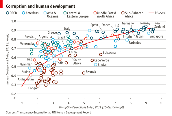
1 | library(ggplot2) |
Basic plot
1 | pc1 <- ggplot(dat,aes(x = CPI, y = HDI, color = Region))+ |
Trend line
1 | pc2 <- pc1 + |
Open points
1 | pc3 <- ggplot(dat,aes(x = CPI, y = HDI, color = Region))+ |
选择性的标注想要的点
1 | pointsToLabel <- c("Russia", "Venezuela", "Iraq", "Myanmar", "Sudan", |
修改图例值和顺序
1 | dat$Region <- factor(dat$Region, |
利用scale来修改x,y轴,颜色和标出title
1 | pc5 <- pc4 + |
微调主题
1 | library(grid) |
四、RNA-Seq (DESeq2)
1 | library(DESeq2) |
五、写在最后
本页内容对应PPT详细请见A Beginner’s Guide to Learn R Programming,其他更多优质资源请阅读 R语言的最好资源,一个就够!