This R tutorial describes how to create line plots using R software and ggplot2 package.
In a line graph, observations are ordered by x value and connected.
The functions geom_line(), geom_step(), or geom_path() can be used.
x value (for x axis) can be :
![]()
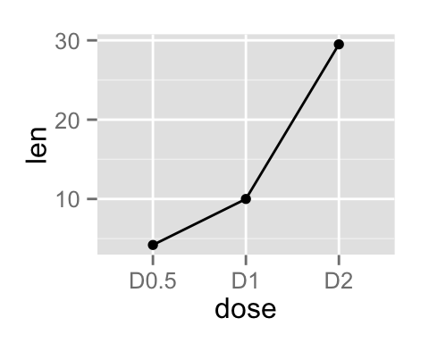
Basic line plots
Data
Data derived from ToothGrowth data sets are used. ToothGrowth describes the effect of Vitamin C on tooth growth in Guinea pigs.
1 | df <- data.frame(dose=c("D0.5", "D1", "D2"), |
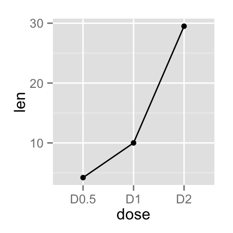
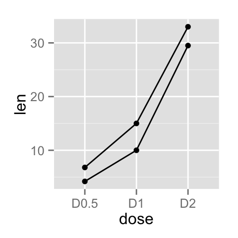
Create line plots with points
1 | # Basic line plot with points |

Read more on line types : ggplot2 line types
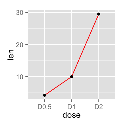
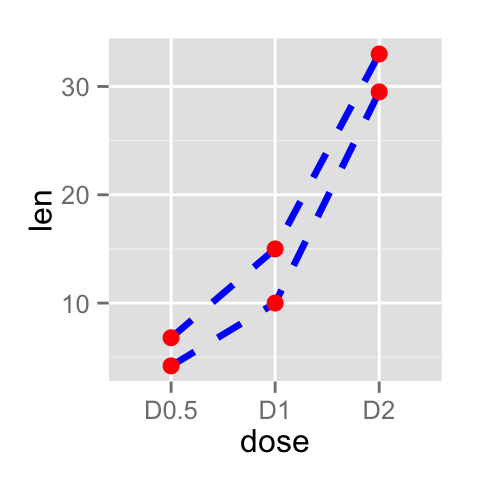
You can add an arrow to the line using the grid package :
1 | library(grid) |
![]()
![]()
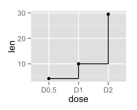
Observations can be also connected using the functions geom_step() or geom_path() :
1 | ggplot(data=df, aes(x=dose, y=len, group=1)) + |
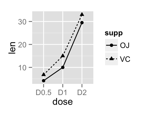
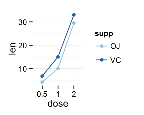
Line plot with multiple groups
Data
Data derived from ToothGrowth data sets are used. ToothGrowth describes the effect of Vitamin C on tooth growth in Guinea pigs. Three dose levels of Vitamin C (0.5, 1, and 2 mg) with each of two delivery methods [orange juice (OJ) or ascorbic acid (VC)] are used :
1 | df2 <- data.frame(supp=rep(c("VC", "OJ"), each=3), |
Create line plots
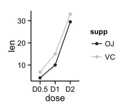
In the graphs below, line types, colors and sizes are the same for the two groups :
1 | # Line plot with multiple groups |
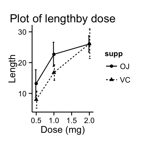
Change line types by groups
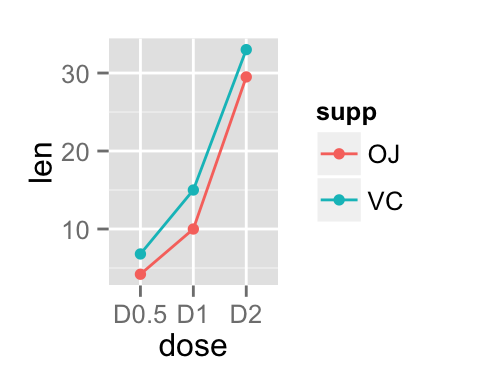
In the graphs below, line types and point shapes are controlled automatically by the levels of the variable supp :
1 | # Change line types by groups (supp) |

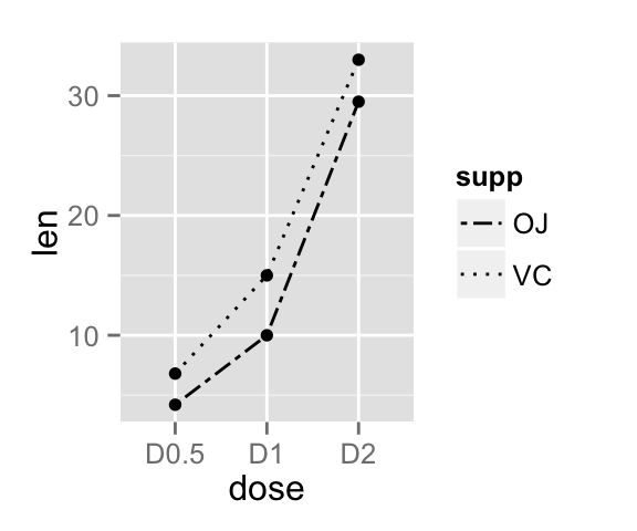
It is also possible to change manually the line types using the function scale_linetype_manual().
1 | # Set line types manually |
You can read more on line types here : ggplot2 line types
If you want to change also point shapes, read this article : ggplot2 point shapes
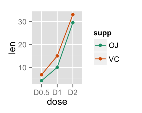
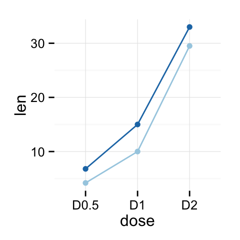
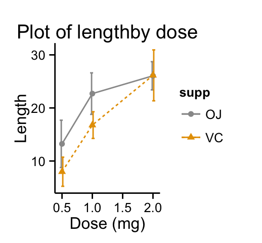
Change line colors by groups
Line colors are controlled automatically by the levels of the variable supp :
1 | p<-ggplot(df2, aes(x=dose, y=len, group=supp)) + |
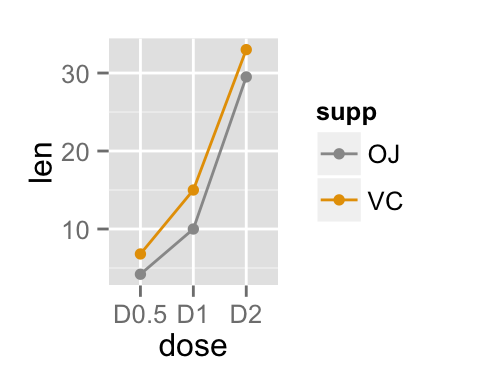
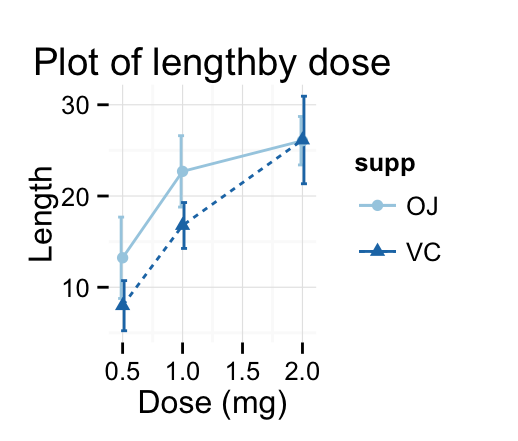
It is also possible to change manually line colors using the functions :
1 | # Use custom color palettes |
Read more on ggplot2 colors here : ggplot2 colors
Change the legend position
1 | p <- p + scale_color_brewer(palette="Paired")+ |
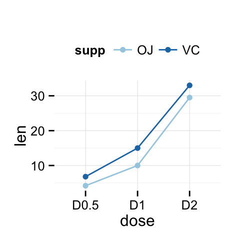
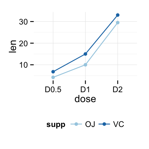
The allowed values for the arguments legend.position are : “left”,”top”, “right”, “bottom”.
Read more on ggplot legend : ggplot2 legend
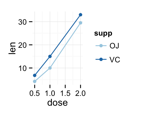
Line plot with a numeric x-axis
If the variable on x-axis is numeric, it can be useful to treat it as a continuous or a factor variable depending on what you want to do :
1 | # Create some data |
1 | # x axis treated as continuous variable |
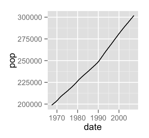
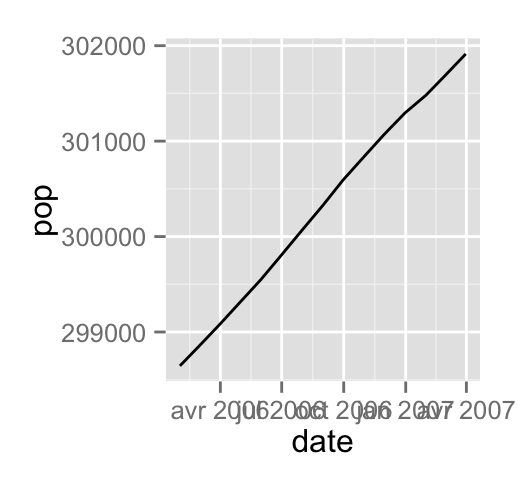
Line plot with dates on x-axis
economics time series data sets are used :
1 | head(economics) |
Plots :
1 | # Basic line plot |
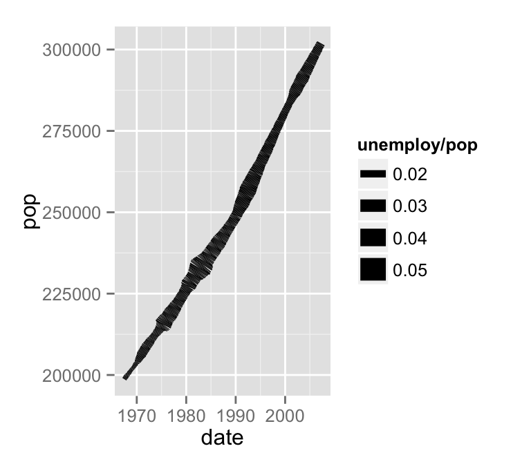
Change line size :
1 | # Change line size |
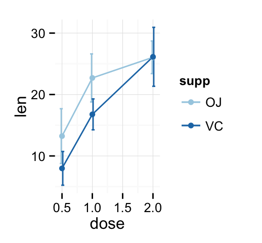
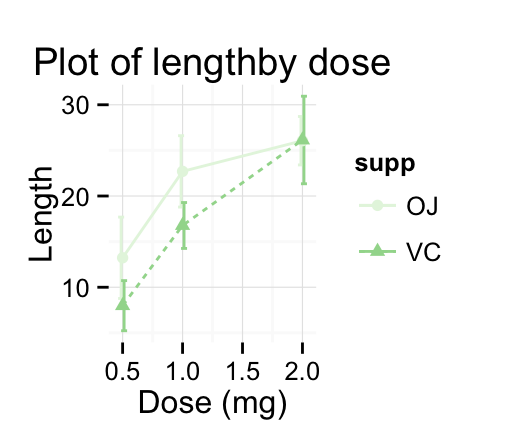
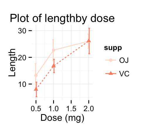
Line graph with error bars
The function below will be used to calculate the mean and the standard deviation, for the variable of interest, in each group :
1 | #+++++++++++++++++++++++++ |
Summarize the data :
1 | df3 <- data_summary(ToothGrowth, varname="len", |
The function geom_errorbar() can be used to produce a line graph with error bars :
1 | # Standard deviation of the mean |

Customized line graphs
1 | # Simple line plot |
Change colors manually :
1 | p + scale_color_brewer(palette="Paired") + theme_minimal() |
Infos
This analysis has been performed using R software (ver. 3.1.2) and ggplot2 (ver. 1.0.0)
Contribution from :http://www.sthda.com/english/wiki/ggplot2-line-plot-quick-start-guide-r-software-and-data-visualization