ggplot2 error bars (finished)-Quick start guide - R software and data visualization

This tutorial describes how to create a graph with error bars using R software and ggplot2 package. There are different types of error bars which can be created using the functions below :


  • geom_errorbar()

  • geom_linerange()

  • geom_pointrange()

  • geom_crossbar()

  • geom_errorbarh()


Add error bars to a bar and line plots


Prepare the data


ToothGrowth data is used. It describes the effect of Vitamin C on tooth growth in Guinea pigs. Three dose levels of Vitamin C (0.5, 1, and 2 mg) with each of two delivery methods [orange juice (OJ) or ascorbic acid (VC)] are used :


1
2
3
4
5
6
7
8
9
10
11
library(ggplot2)
df <- ToothGrowth
df$dose <- as.factor(df$dose)
head(df)
len supp dose
1 4.2 VC 0.5
2 11.5 VC 0.5
3 7.3 VC 0.5
4 5.8 VC 0.5
5 6.4 VC 0.5
6 10.0 VC 0.5


  • len : Tooth length

  • dose : Dose in milligrams (0.5, 1, 2)

  • supp : Supplement type (VC or OJ)

  • In the example below, we’ll plot the mean value of Tooth length in each group. The standard deviation is used to draw the error bars on the graph.


    First, the helper function below will be used to calculate the mean and the standard deviation, for the variable of interest, in each group :


    1
    2
    3
    4
    5
    6
    7
    8
    9
    10
    11
    12
    13
    14
    15
    16
    17
    18
    19
    20
    #+++++++++++++++++++++++++
    # Function to calculate the mean and the standard deviation
    # for each group
    #+++++++++++++++++++++++++
    # data : a data frame
    # varname : the name of a column containing the variable
    #to be summariezed
    # groupnames : vector of column names to be used as
    # grouping variables
    data_summary <- function(data, varname, groupnames){
    require(plyr)
    summary_func <- function(x, col){
    c(mean = mean(x[[col]], na.rm=TRUE),
    sd = sd(x[[col]], na.rm=TRUE))
    }
    data_sum<-ddply(data, groupnames, .fun=summary_func,
    varname)
    data_sum <- rename(data_sum, c("mean" = varname))
    return(data_sum)
    }


    Summarize the data :


    1
    2
    3
    4
    5
    6
    7
    8
    9
    10
    11
    12
    df2 <- data_summary(ToothGrowth, varname="len", 
    groupnames=c("supp", "dose"))
    # Convert dose to a factor variable
    df2$dose=as.factor(df2$dose)
    head(df2)
    supp dose len sd
    1 OJ 0.5 13.23 4.459709
    2 OJ 1 22.70 3.910953
    3 OJ 2 26.06 2.655058
    4 VC 0.5 7.98 2.746634
    5 VC 1 16.77 2.515309
    6 VC 2 26.14 4.797731


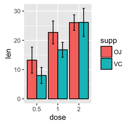
    Barplot with error bars


    The function geom_errorbar() can be used to produce the error bars :


    1
    2
    3
    4
    5
    6
    7
    8
    9
    10
    11
    12
    13
    library(ggplot2)
    # Default bar plot
    p<- ggplot(df2, aes(x=dose, y=len, fill=supp)) +
    geom_bar(stat="identity", color="black",
    position=position_dodge()) +
    geom_errorbar(aes(ymin=len-sd, ymax=len+sd), width=.2,
    position=position_dodge(.9))
    print(p)

    # Finished bar plot
    p+labs(title="Tooth length per dose", x="Dose (mg)", y = "Length")+
    theme_classic() +
    scale_fill_manual(values=c('#999999','#E69F00'))


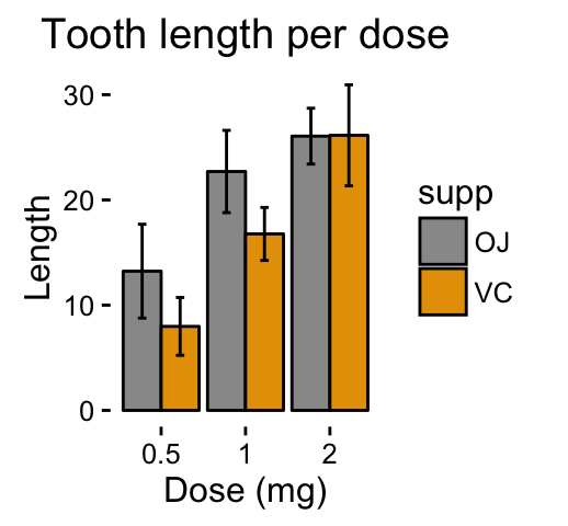
    Note that, you can chose to keep only the upper error bars
    1
    2
    3
    4
    5
    # Keep only upper error bars
    ggplot(df2, aes(x=dose, y=len, fill=supp)) +
    geom_bar(stat="identity", color="black", position=position_dodge()) +
    geom_errorbar(aes(ymin=len, ymax=len+sd), width=.2,
    position=position_dodge(.9))


    Read more on ggplot2 bar graphs : ggplot2 bar graphs


    Line plot with error bars


    1
    2
    3
    4
    5
    6
    7
    8
    9
    10
    11
    12
    # Default line plot
    p<- ggplot(df2, aes(x=dose, y=len, group=supp, color=supp)) +
    geom_line() +
    geom_point()+
    geom_errorbar(aes(ymin=len-sd, ymax=len+sd), width=.2,
    position=position_dodge(0.05))
    print(p)

    # Finished line plot
    p+labs(title="Tooth length per dose", x="Dose (mg)", y = "Length")+
    theme_classic() +
    scale_color_manual(values=c('#999999','#E69F00'))


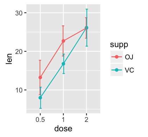
    You can also use the functions geom_pointrange() or geom_linerange() instead of using geom_errorbar()


    1
    2
    3
    4
    5
    6
    7
    8
    # Use geom_pointrange
    ggplot(df2, aes(x=dose, y=len, group=supp, color=supp)) +
    geom_pointrange(aes(ymin=len-sd, ymax=len+sd))

    # Use geom_line()+geom_pointrange()
    ggplot(df2, aes(x=dose, y=len, group=supp, color=supp)) +
    geom_line()+
    geom_pointrange(aes(ymin=len-sd, ymax=len+sd))


    Read more on ggplot2 line plots : ggplot2 line plots


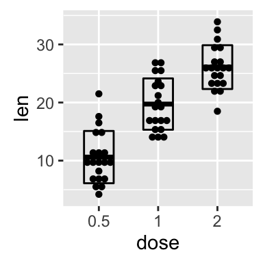
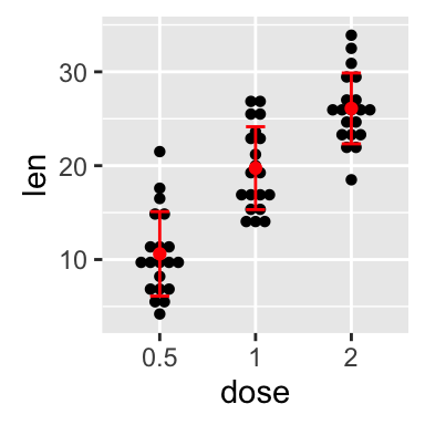
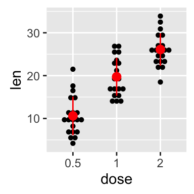
    Dot plot with mean point and error bars


    The functions geom_dotplot() and stat_summary() are used :


    The mean +/- SD can be added as a crossbar , a error bar or a pointrange :


    1
    2
    3
    4
    5
    6
    7
    8
    9
    10
    11
    12
    13
    14
    15
    p <- ggplot(df, aes(x=dose, y=len)) + 
    geom_dotplot(binaxis='y', stackdir='center')

    # use geom_crossbar()
    p + stat_summary(fun.data="mean_sdl", mult=1,
    geom="crossbar", width=0.5)

    # Use geom_errorbar()
    p + stat_summary(fun.data=mean_sdl, mult=1,
    geom="errorbar", color="red", width=0.2) +
    stat_summary(fun.y=mean, geom="point", color="red")

    # Use geom_pointrange()
    p + stat_summary(fun.data=mean_sdl, mult=1,
    geom="pointrange", color="red")


    Read more on ggplot2 dot plots : ggplot2 dot plot


    Infos


    This analysis has been performed using R software (ver. 3.1.2) and ggplot2 (ver. 1.0.0)

    Contribution from :http://www.sthda.com/english/wiki/ggplot2-error-bars-quick-start-guide-r-software-and-data-visualization

    tiramisutes wechat
    欢迎关注
    0%