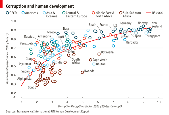
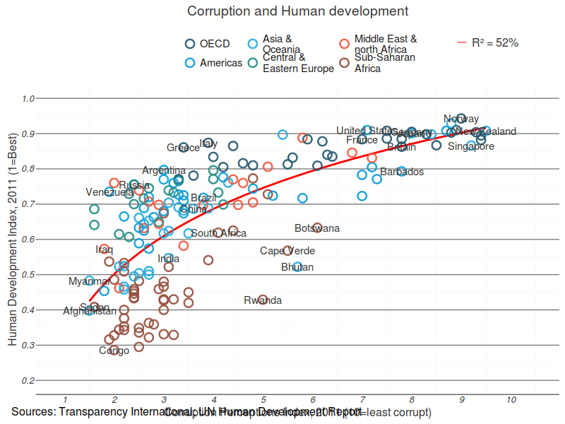
原图:http://www.economist.com/node/21541178
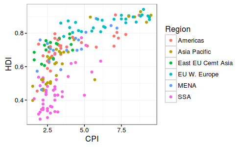
Basic plot
1 | library(ggplot2) |
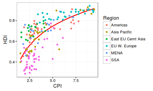
Trend line
1 | pc2 <- pc1 + |
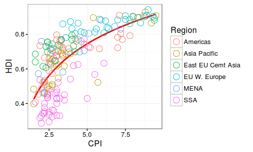
Open points
1 | pc3 <- pc2 + |
Labelling points
1 | pointsToLabel <- c("Russia", "Venezuela", "Iraq", "Myanmar", "Sudan", |
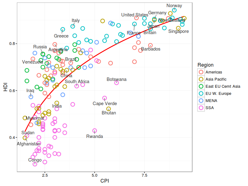
选择性的标注想要的点
Change the region labels and order
1 | dat$Region <- factor(dat$Region, |
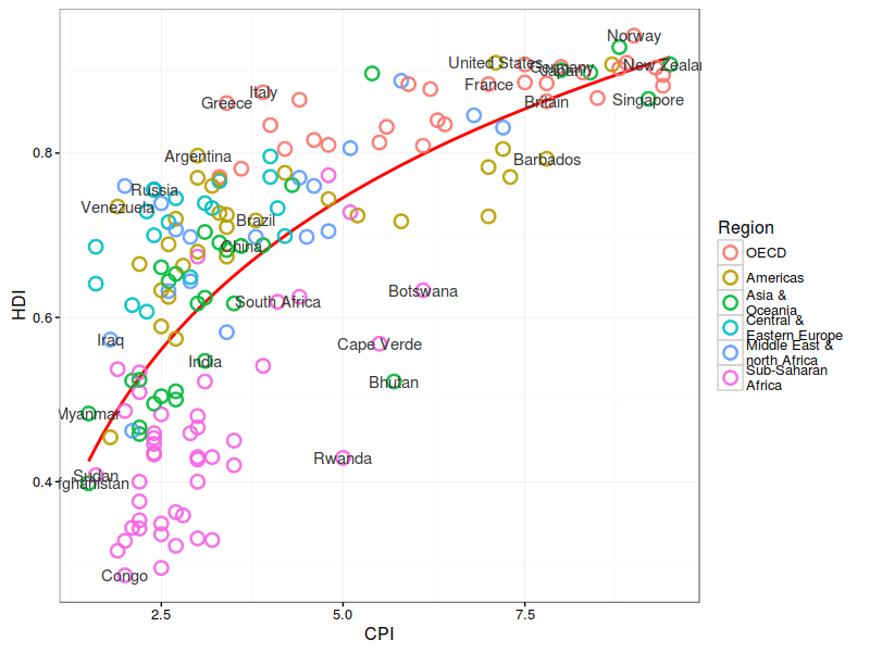
修改图例值和顺序
Add title and format axes
1 | library(grid) |
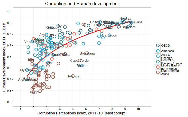
利用scale来修改x,y轴,颜色和标出title
Theme tweaks
1 | library(grid) # for the 'unit' function |
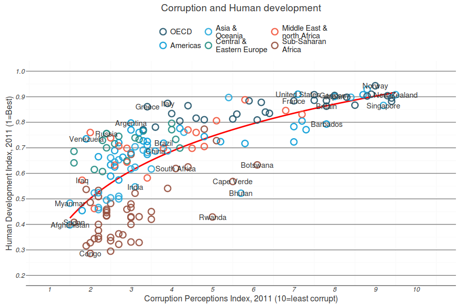
微调主题
Add model R^2 and source note
1 | mR2 <- summary(lm(HDI ~ log(CPI), data = dat))$r.squared |
Contribution from :
http://tutorials.iq.harvard.edu/R/Rgraphics/Rgraphics.html