Easy way to mix multiple graphs on the same page - R software and data visualization
Install and load required packages
1 | install.packages("gridExtra") |
Prepare some data
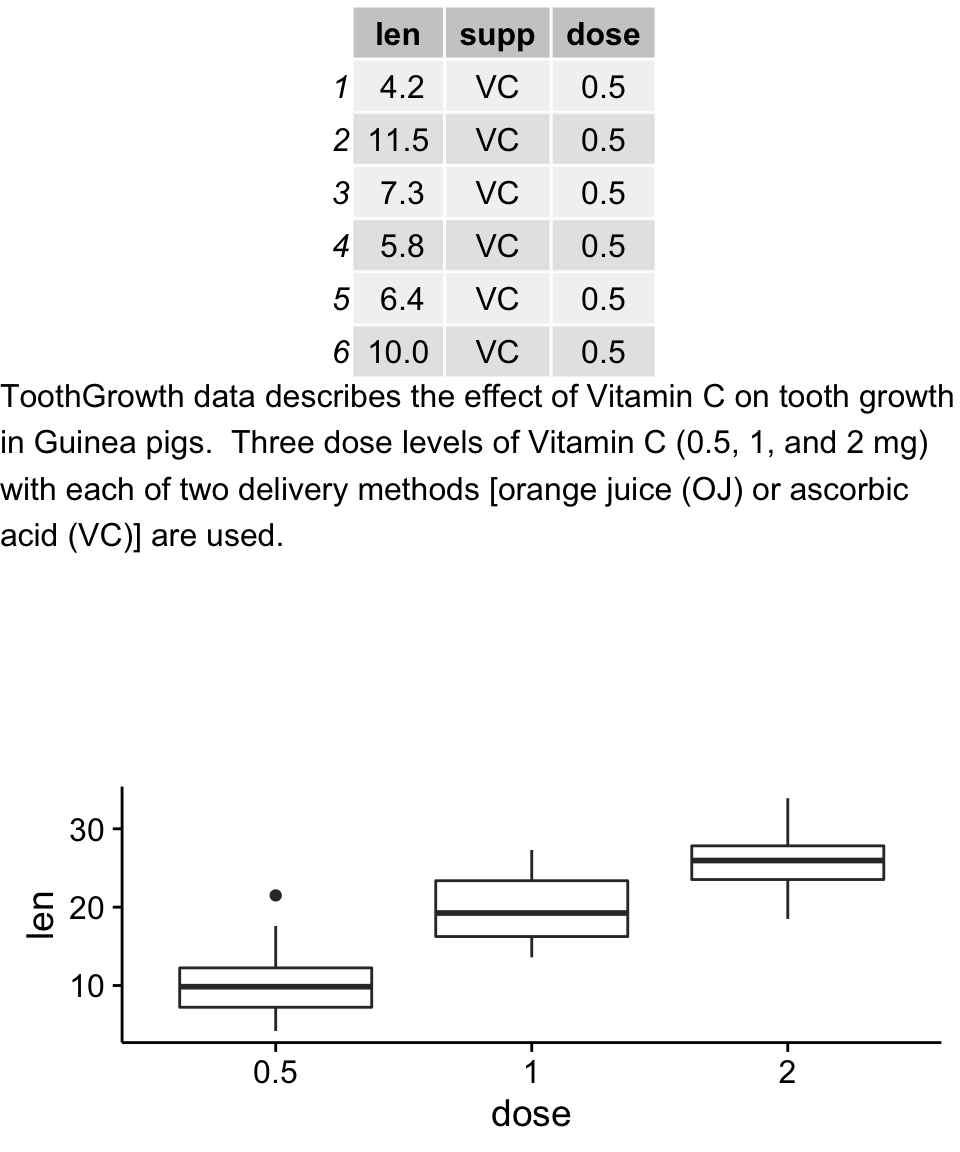
1 | df <- ToothGrowth |
Cowplot: Publication-ready plots
The cowplot package is an extension to ggplot2 and it can be used to provide a publication-ready plots.
Basic plots
1 | library(cowplot) |

Recall that, the function ggsave()[in ggplot2 package] can be used to save ggplots. However, when working with cowplot, the function save_plot() [in cowplot package] is preferred. It’s an alternative to ggsave with a better support for multi-figur plots.1
2
3save_plot("mpg.pdf", plot.mpg,
base_aspect_ratio = 1.3 # make room for figure legend
)
Arranging multiple graphs using cowplot
1 | # Scatter plot |
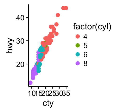
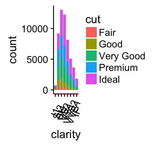
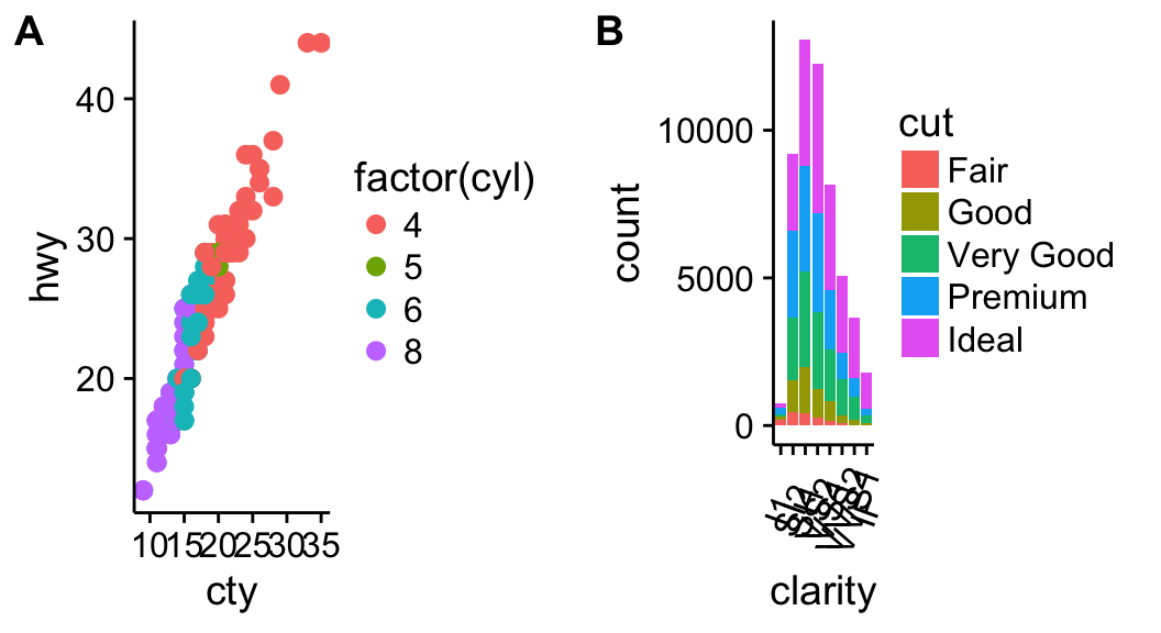
Combine the two plots (the scatter plot and the bar plot):1
plot_grid(sp, bp, labels=c("A","B"), ncol = 2, nrow = 1)
The function draw_plot() can be used to place graphs at particular locations with a particular sizes. The format of the function is:1
draw_plot(plot, x = 0, y = 0, width = 1, height = 1)
The function ggdraw() is used to initialize an empty drawing canvas.
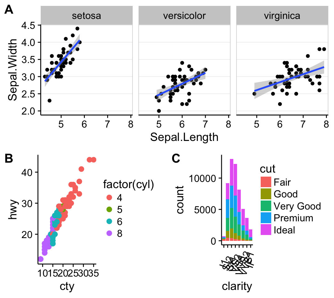
1 | plot.iris <- ggplot(iris, aes(Sepal.Length, Sepal.Width)) + |
grid.arrange: Create and arrange multiple plots
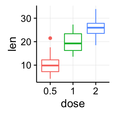
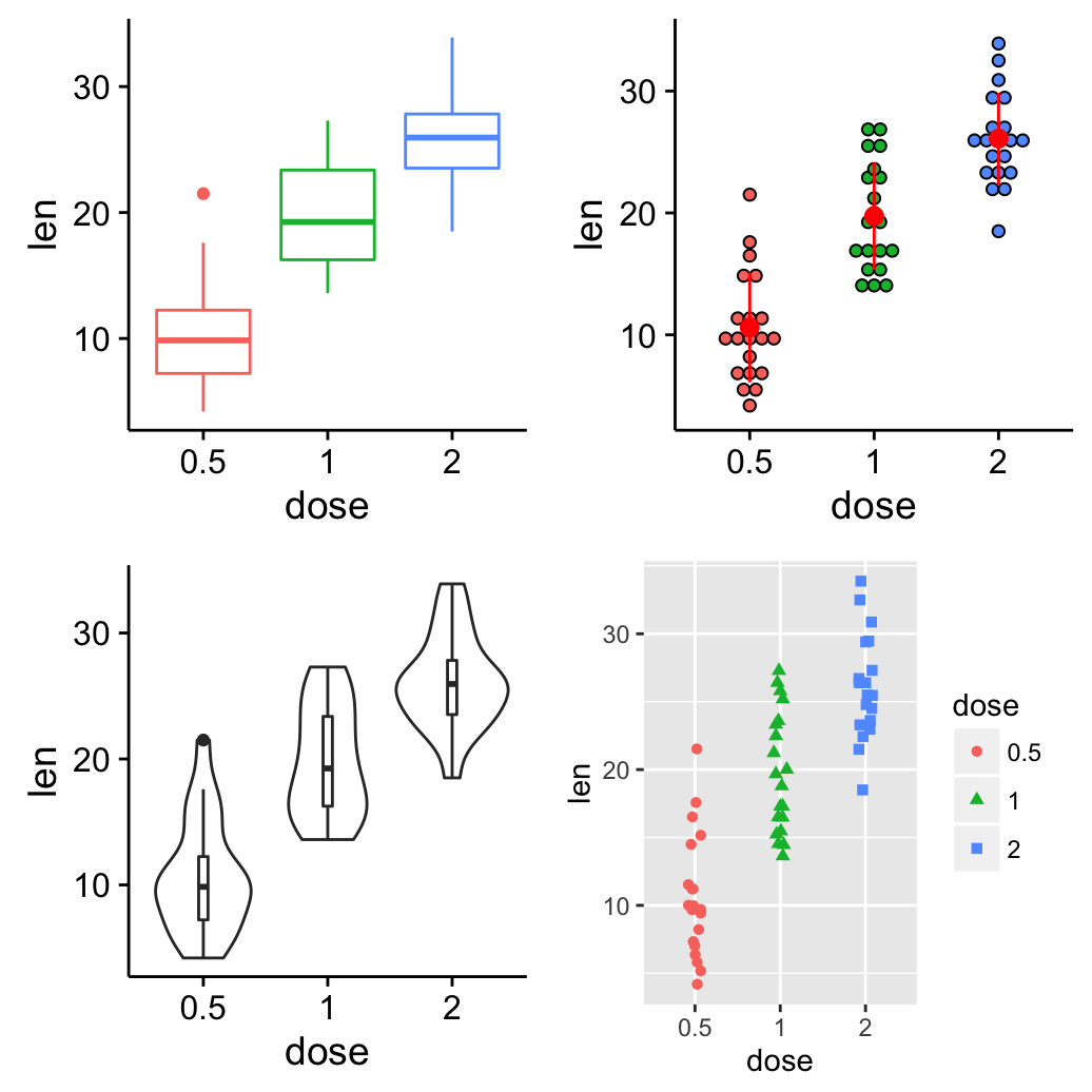
The R code below creates a box plot, a dot plot, a violin plot and a stripchart (jitter plot) :1
2
3
4
5
6
7
8
9
10
11
12
13
14
15
16
17
18
19
20
21
22
23
24library(ggplot2)
# Create a box plot
bp <- ggplot(df, aes(x=dose, y=len, color=dose)) +
geom_boxplot() +
theme(legend.position = "none")
# Create a dot plot
# Add the mean point and the standard deviation
dp <- ggplot(df, aes(x=dose, y=len, fill=dose)) +
geom_dotplot(binaxis='y', stackdir='center')+
stat_summary(fun.data=mean_sdl, mult=1,
geom="pointrange", color="red")+
theme(legend.position = "none")
# Create a violin plot
vp <- ggplot(df, aes(x=dose, y=len)) +
geom_violin()+
geom_boxplot(width=0.1)
# Create a stripchart
sc <- ggplot(df, aes(x=dose, y=len, color=dose, shape=dose)) +
geom_jitter(position=position_jitter(0.2))+
theme(legend.position = "none") +
theme_gray()
Combine the plots using the function grid.arrange() [in gridExtra] :1
2
3library(gridExtra)
grid.arrange(bp, dp, vp, sc, ncol=2,
main="Multiple plots on the same page")
Add a common legend for multiple ggplot2 graphs
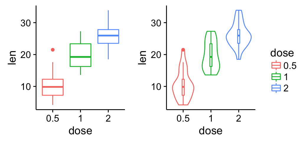
This can be done in four simple steps :
To save the legend of a ggplot, the helper function below can be used :
1 | library(gridExtra) |
(The function above is derived from this forum. )1
2
3
4
5
6
7
8
9
10
11
12
13
14
15
16
17
18
19
20
21
22# 1. Create the plots
#++++++++++++++++++++++++++++++++++
# Create a box plot
bp <- ggplot(df, aes(x=dose, y=len, color=dose)) +
geom_boxplot()
# Create a violin plot
vp <- ggplot(df, aes(x=dose, y=len, color=dose)) +
geom_violin()+
geom_boxplot(width=0.1)+
theme(legend.position="none")
# 2. Save the legend
#+++++++++++++++++++++++
legend <- get_legend(bp)
# 3. Remove the legend from the box plot
#+++++++++++++++++++++++
bp <- bp + theme(legend.position="none")
# 4. Arrange ggplot2 graphs with a specific width
grid.arrange(bp, vp, legend, ncol=3, widths=c(2.3, 2.3, 0.8))
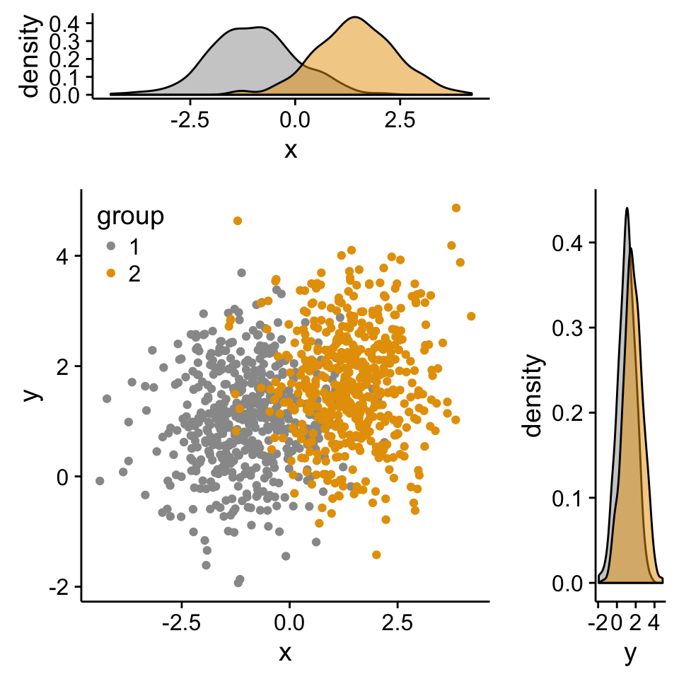
Scatter plot with marginal density plots
Step 1/3. Create some data :1
2
3
4
5
6
7
8
9
10
11
12x <- c(rnorm(500, mean = -1), rnorm(500, mean = 1.5))
y <- c(rnorm(500, mean = 1), rnorm(500, mean = 1.7))
group <- as.factor(rep(c(1,2), each=500))
df2 <- data.frame(x, y, group)
head(df2)
## x y group
## 1 -2.20706575 -0.2053334 1
## 2 -0.72257076 1.3014667 1
## 3 0.08444118 -0.5391452 1
## 4 -3.34569770 1.6353707 1
## 5 -0.57087531 1.7029518 1
## 6 -0.49394411 -0.9058829 1
Step 2/3. Create the plots :1
2
3
4
5
6
7
8
9
10
11
12
13
14
15
16
17
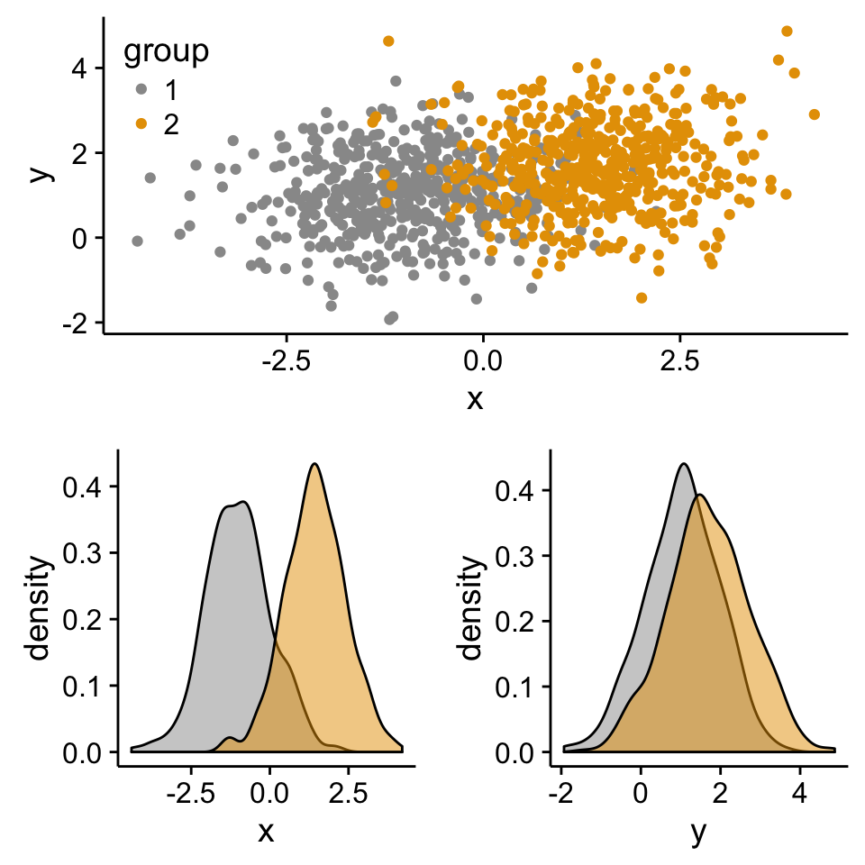
18# Scatter plot of x and y variables and color by groups
scatterPlot <- ggplot(df2,aes(x, y, color=group)) +
geom_point() +
scale_color_manual(values = c('#999999','#E69F00')) +
theme(legend.position=c(0,1), legend.justification=c(0,1))
# Marginal density plot of x (top panel)
xdensity <- ggplot(df2, aes(x, fill=group)) +
geom_density(alpha=.5) +
scale_fill_manual(values = c('#999999','#E69F00')) +
theme(legend.position = "none")
# Marginal density plot of y (right panel)
ydensity <- ggplot(df2, aes(y, fill=group)) +
geom_density(alpha=.5) +
scale_fill_manual(values = c('#999999','#E69F00')) +
theme(legend.position = "none")
Create a blank placeholder plot :1
2
3
4
5
6
7
8
9
10
11
12
13
14lankPlot <- ggplot()+geom_blank(aes(1,1))+
theme(
plot.background = element_blank(),
panel.grid.major = element_blank(),
panel.grid.minor = element_blank(),
panel.border = element_blank(),
panel.background = element_blank(),
axis.title.x = element_blank(),
axis.title.y = element_blank(),
axis.text.x = element_blank(),
axis.text.y = element_blank(),
axis.ticks = element_blank(),
axis.line = element_blank()
)
Step 3/3. Put the plots together:
Arrange ggplot2 with adapted height and width for each row and column :1
2
3library("gridExtra")
grid.arrange(xdensity, blankPlot, scatterPlot, ydensity,
ncol=2, nrow=2, widths=c(4, 1.4), heights=c(1.4, 4))
Create a complex layout using the function viewport()
The different steps are :
1 | # Move to a new page |
Insert an external graphical element inside a ggplot
The function annotation_custom() [in ggplot2] can be used for adding tables, plots or other grid-based elements. The simplified format is :1
annotation_custom(grob, xmin, xmax, ymin, ymax)
The different steps are :
As the inset box plot overlaps with some points, a transparent background is used for the box plots.
1 | # Create a transparent theme object |
Create the graphs :1
2
3
4
5
6
7
8
9
10
11
12
13
14
15
16
17
18
19
20
21
22
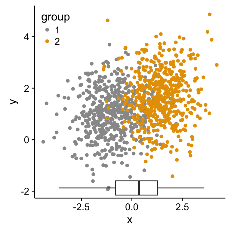
23p1 <- scatterPlot # see previous sections for the scatterPlot
# Box plot of the x variable
p2 <- ggplot(df2, aes(factor(1), x))+
geom_boxplot(width=0.3)+coord_flip()+
transparent_theme
# Box plot of the y variable
p3 <- ggplot(df2, aes(factor(1), y))+
geom_boxplot(width=0.3)+
transparent_theme
# Create the external graphical elements
# called a "grop" in Grid terminology
p2_grob = ggplotGrob(p2)
p3_grob = ggplotGrob(p3)
# Insert p2_grob inside the scatter plot
xmin <- min(x); xmax <- max(x)
ymin <- min(y); ymax <- max(y)
p1 + annotation_custom(grob = p2_grob, xmin = xmin, xmax = xmax,
ymin = ymin-1.5, ymax = ymin+1.5)
1
2
3
4# Insert p3_grob inside the scatter plot
p1 + annotation_custom(grob = p3_grob,
xmin = xmin-1.5, xmax = xmin+1.5,
ymin = ymin, ymax = ymax)
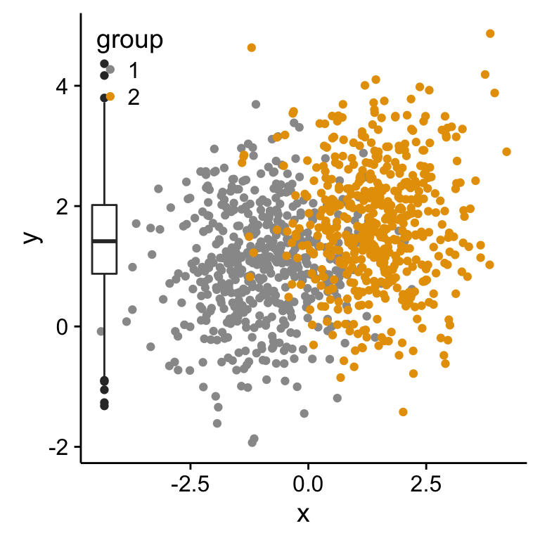
If you have a solution to insert, at the same time, both p2_grob and p3_grob inside the scatter plot, please let me a comment. I got some errors trying to do this…
Mix table, text and ggplot2 graphs
The functions below are required :
Make sure that the package RGraphics is installed.
1 | library(RGraphics) |
Infos
This analysis has been performed using R software (ver. 3.1.2) and ggplot2 (ver. 1.0.0)
Contribution from :http://www.sthda.com/english/wiki/ggplot2-easy-way-to-mix-multiple-graphs-on-the-same-page-r-software-and-data-visualization