The bar geom is used to produce 1d area plots: bar charts for categorical x, and histograms for continuous y. stat_bin explains the details of these summaries in more detail. In particular, you can use the weight aesthetic to create weighted histograms and barcharts where the height of the bar no longer represent a count of observations, but a sum over some other variable. See the examples for a practical example.
Usage
1 | geom_bar(mapping = NULL, data = NULL, stat = "bin", position = "stack", ...) |
Aesthetics
geom_bar understands the following aesthetics (required aesthetics are in bold):
xalphacolourfilllinetypesizeweightGrouping Bars Together
1 | p<- ggplot(df2, aes(x=sample, y=high, fill=sample)) + |
代码解释
aes中fill可指定不同类显示柱子颜色.
geom_bar()的fill修改柱子填充颜色,color修改柱子外围颜色.
theme()控制图例.
labs()添加x,y轴和主题标签.1
scale_fill_brewer(palette="Pastel1") #亦可用来修改柱子颜色
在柱状图中使用不同颜色—把适当的变量映射到Fill中
1 | ggplot(upc, aes(x=reorder(Abb, Change), y=Change, fill=Region)) + |
代码解释
reorder函数,把柱状图按照大小排列.
xlab()对x轴修改坐标轴注释.
其方法随可以为不同柱子fill不同颜色,但所填充颜色是ggplot2系统自动生成,有时候颜色不好看想要修改为你自己制定的颜色,方法如下:
方法1:breaks()1
2
3
4
5
6
7
8
9
10
11
12
13
14
15
16MYdata <- data.frame(Age = rep(c(0,1,3,6,9,12), each=20),
Richness = rnorm(120, 10000, 2500))
ggplot(data = MYdata, aes(x = Age, y = Richness)) +
geom_boxplot(aes(fill=factor(Age))) +
geom_point(aes(color = factor(Age))) +
scale_x_continuous(breaks = c(0, 1, 3, 6, 9, 12)) +
scale_colour_manual(breaks = c("0", "1", "3", "6", "9", "12"),
labels = c("0 month", "1 month", "3 months",
"6 months", "9 months", "12 months"),
values = c("#E69F00", "#56B4E9", "#009E73",
"#F0E442", "#0072B2", "#D55E00")) +
scale_fill_manual(breaks = c("0", "1", "3", "6", "9", "12"),
labels = c("0 month", "1 month", "3 months",
"6 months", "9 months", "12 months"),
values = c("#E69F00", "#56B4E9", "#009E73",
"#F0E442", "#0072B2", "#D55E00"))
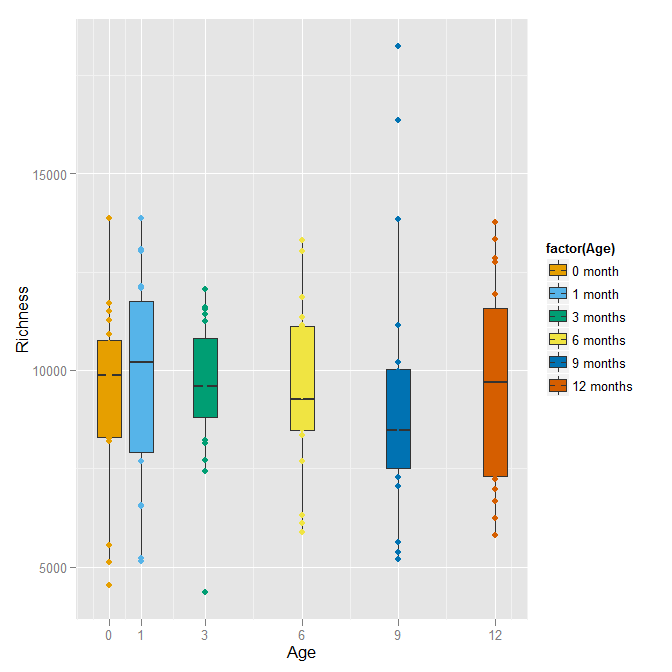
With this color scheme, the points that fall inside the boxplot are not visible (since they are the same color as the boxplot’s fill). Perhaps leaving the boxplot hollow and drawing its lines in the color would be better.1
2
3
4
5
6
7
8
9ggplot(data = MYdata, aes(x = Age, y = Richness)) +
geom_boxplot(aes(colour=factor(Age)), fill=NA) +
geom_point(aes(color = factor(Age))) +
scale_x_continuous(breaks = c(0, 1, 3, 6, 9, 12)) +
scale_colour_manual(breaks = c("0", "1", "3", "6", "9", "12"),
labels = c("0 month", "1 month", "3 months",
"6 months", "9 months", "12 months"),
values = c("#E69F00", "#56B4E9", "#009E73",
"#F0E442", "#0072B2", "#D55E00"))
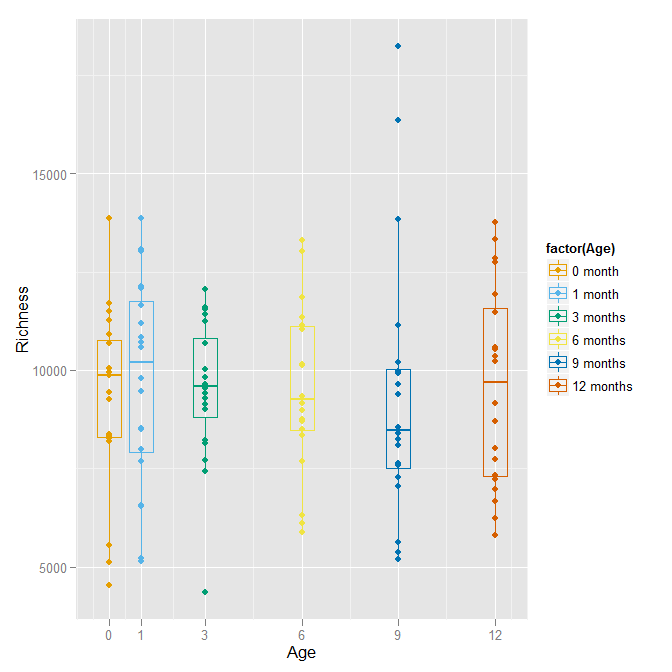
代码解释
操作自己数据时可能会出现报错 “Continuous value supplied to discrete scale” ,Brian Diggs大神给出的解释是:
Age is a continuous variable, but you are trying to use it in a discrete scale (by specifying the color for specific values of age). In general, a scale maps the variable to the visual; for a continuous age, there is a corresponding color for every possible value of age, not just the ones that happen to appear in your data. However, you can simultaneously treat age as a categorical variable (factor) for some of the aesthetics. For the third part of your question, within the scale description, you can define specific labels corresponding to specific breaks in the scale.
也就是要转换连续型变量为因子变量.
方法2:Change the default palettes
These are color-blind-friendly palettes, one with gray, and one with black.


To use with ggplot2, it is possible to store the palette in a variable, then use it later.
1 | # The palette with grey: |
Coloring Negative and Postive Bars Differently—设定新的变量,将新建变量映射到fill中
1 | csub <- subset(climate, Source=="Berkeley" & Year >= 1900) |
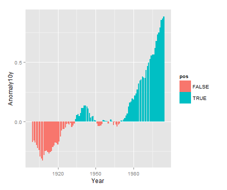
代码解释
首先通过subset()函数选取一个数集赋值到csub,选取原则为:climate数据中Source这一列值为Berkeley并且Year这一列>= 1900.
csub$pos为原数集添加pos这一列,若Anomaly10y >= 0则其值为TRUE,否则为FALSE.1
2
3
4
5
6
7
8
9
10
11
12
13
14 Source Year Anomaly1y Anomaly5y Anomaly10y Unc10y pos
155 Berkeley 1954 NA NA -0.032 0.038 FALSE
156 Berkeley 1955 NA NA -0.022 0.035 FALSE
157 Berkeley 1956 NA NA 0.012 0.031 TRUE
158 Berkeley 1957 NA NA 0.007 0.028 TRUE
159 Berkeley 1958 NA NA 0.002 0.027 TRUE
160 Berkeley 1959 NA NA 0.002 0.026 TRUE
161 Berkeley 1960 NA NA -0.019 0.026 FALSE
162 Berkeley 1961 NA NA -0.001 0.021 FALSE
163 Berkeley 1962 NA NA 0.017 0.018 TRUE
164 Berkeley 1963 NA NA 0.004 0.016 TRUE
165 Berkeley 1964 NA NA -0.028 0.018 FALSE
166 Berkeley 1965 NA NA -0.006 0.017 FALSE
167 Berkeley 1966 NA NA -0.024 0.017 FALSE
最后将pos映射到fill,geom_bar()中size改变柱子外框黑线的厚度.
scale_fill_manual()进行修改颜色,通过设定guide=FALSE 去掉图例.
geom_bar(width=0.5)调整width改变柱子宽度,也就是改变了柱子之间的距离.
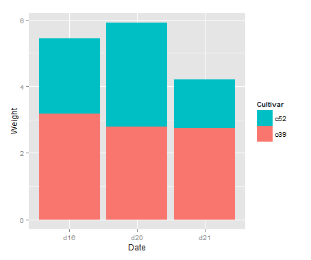
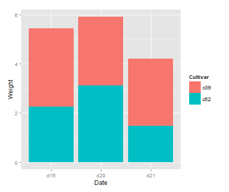
pylr改变图中堆积的颜色—order=desc()
1 | library(plyr) # Needed for desc() |
Making a Propotional Stacked Bar Graph
1 | library(gcookbook) # For the data set |
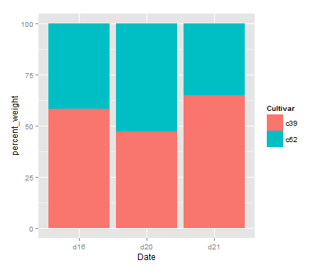
plyr里ddply的语法解析
cabbage是数据集
“Date” 通俗来说就是x轴的变量
transform是要做的变形,在ddply中还有summarize等
最后一项是是新建的变量和变型方法
柱条上添加文字
1 | library(ggplot2) |
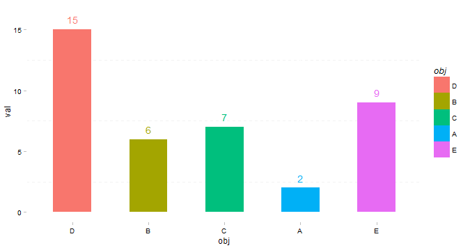
代码解释
ggthemes为ggplot2的一个主题包,通过theme_pander()修改ggplot2默认主题(theme).1
dt$obj是因子类型,ggplot2作图时按照因子水平顺序来的,所以修改因子水平的顺序即可修改作图顺序,具体可以输出dt$obl.
另一种改变柱子顺序方式:1
p + scale_x_discrete(limits=c('D','B','C','A','E'))
Contribution from :http://yangchao.me/2013/02/ggplot2-bar-chart/
http://www.bubuko.com/infodetail-1051940.html
http://stackoverflow.com/questions/10805643/ggplot2-add-color-to-boxplot-continuous-value-supplied-to-discrete-scale-er