hope

A new day is coming,whether we like it or not. The question is will you control it,or will it control you?


  • Home

  • Archives

  • Code

  • Categories

  • Tags

  • Footprint

  • qRT-PCR

  • Project

  • Publish

  • SCI Figure

  • About

  • CV

  • Search

ANOVA单因素方差分析与R实现

Posted on 2015-10-08 | In R | Comments: | Views: ℃
| Words count in article: | Reading time ≈

单因子方差分析

        方差分析(analysis of variance, 简写为ANOVA)是工农业生产和科学研究中分析试验数据的一种有效的统计方法. 引起观测值不同(波动)的原因主要有两类: 一类是试验过程中随机因素的干扰或观测误差所引起不可控制的的波动, 另一类则是由于试验中处理方式不同或试验条件不同引起的可以控制的波动.
        方差分析的主要工作就是将观测数据的总变异(波动)按照变异的原因的不同分解为因子效应与试验误差,并对其作出数量分析,发现多组数据之间的差异显著行,比较各种原因在总变异中所占的重要程度,以此作为进一步统计推断的依据.
在进行方差分析之前先对几条假设进行检验,由于随机抽取,假设总体满足独立、正态,考察方差齐次性(用bartlett检验).

正态性检验

在进行方差分析前先对输入数据做正态性检验。
对数据的正态性,利用Shapiro-Wilk正态检验方法(W检验),它通常用于样本容量n≤50时,检验样本是否符合正态分布。

R中,函数shapiro.test()提供了W统计量和相应P值,所以可以直接使用P值作为判断标准(P值大于0.05说明数据正态),其调用格式为shapiro.test(x),参数x即所要检验的数据集,它是长度在3到5000之间的向量。

1
2
3
4
5
6
7
8
9
10
nx <- c(rnorm(10))
nx
[1] -0.83241783 -0.29609562 -0.06736888 -0.02366562
0.23652392 0.97570959
[7] -0.85301145 1.51769488 -0.84866517 0.20691119
shapiro.test(nx)
Shapiro-Wilk normality test
data: nx
W = 0.9084, p-value = 0.2699
#检验结果,因为p 值小于W 值,所以数据为正态分布.

更多正态性检验见:R语言做正态分布检验
其中,D检验(Kolmogorov - Smirnov)是比较精确的正态检验法。

  • SPSS 规定:当样本含量3 ≤n ≤5000 时,结果以Shapiro - Wilk (W 检验) 为准,当样本含量n > 5000 结果以Kolmogorov - Smirnov 为准。
  • SAS 规定:当样本含量n ≤2000 时,结果以Shapiro - Wilk (W 检验) 为准,当样本含量n >2000 时,结果以Kolmogorov - Smirnov (D 检验) 为准。
  • 方差齐性检验

    方差分析的另一个假设:方差齐性,需要检验不同水平下的数据方差是否相等。R中最常用的是Bartlett检验,bartlett.test()调用格式为

    1
    bartlett.test(x,g…)

    其中,参数X是数据向量或列表(list) ; g是因子向量,如果X是列表则忽略g.当使用数据集时,也通过formula调用函数:

    1
    bartlett.test(formala, data, subset,na.action…)

    formula是形如lhs一rhs的方差分析公式;data指明数据集:subset是可选项,可以用来指定观测值的一个子集用于分析:na.action表示遇到缺失值时应当采取的行为。

    1
    2
    3
    4
    5
    6
    7
    8
    > x=c(x1,x2,x3)
    > account=data.frame(x,A=factor(rep(1:3,each=7)))
    > bartlett.test(x~A,data=account)

    Bartlett test of homogeneity of variances

    data: x by A
    Bartlett's K-squared = 0.13625, df = 2, p-value = 0.9341

    由于P值远远大于显著性水平a=0.05,因此不能拒绝原假设,我们认为不同水平下的数据是等方差的。

    方差分析:F-Test

    In R the function var.test allows for the comparison of two variances using an F-test.Although it is possible to compare values of s2 for two samples, there is no capability within R for comparing the variance of a sample,s2,to the variance of a population, σ2. The syntax for the testing variances is :

    1
    var.test(X, Y, ratio = 1, alternative = "two.sided", conf.level = 0.95)

    where X and Y are vectors containing the two samples.
    The optional command ratio is the null hypothesis; the default value is 1 if not specified.
    The command alternative gives the alternative hypothesis should the experimental F-ratio is found to be significantly different than that specified by ratio. The default for alternative is “two-sided” with the other possible choices being “less” or “greater” .
    The command conf.level gives the confidence level to be used in the test and the default value of 0.95 is equivalent to α = 0.05.
    Here is a typical result using the objects std.method and new.method.

    1
    2
    3
    4
    5
    6
    7
    8
    9
    10
    11
    12
    13
    14
    15
    16
    17
    > std.method<-c( 21.62, 22.20, 24.27, 23.54, 24.25, 23.09, 21.01 )
    > new.method<-c(21.54 ,20.51 ,22.31, 21.30, 24.62, 25.72, 21.54 )
    > var(std.method); var(new.method)
    [1] 1.638495
    [1] 3.690329
    > var.test(std.method, new.method)

    F test to compare two variances

    data: std.method and new.method
    F = 0.444, num df = 6, denom df = 6, p-value = 0.3462
    alternative hypothesis: true ratio of variances is not equal to 1
    95 percent confidence interval:
    0.07629135 2.58395513
    sample estimates:
    ratio of variances
    0.4439971

    There are two ways to interpret the results provided by R.
    First, the p-value provides the smallest value of α for which the F-ratio is significantly different from the hypothesized value.
    If this value is larger than the desired α, then there is insufficient evidence to reject the null hypothesis; otherwise, the null hypothesis is rejected. Second, R provides the desired confidence interval for the F-ratio;
    if the calculated value falls within the confidence interval, then the null hypothesis is retained. For this example, the null hypothesis is retained and we find no evidence for a difference in the variances for the objects std.method and new.method. Note that R does not restrict the F-ratio to values greater than 1.
    1)判断组间是否有差别
    R中的函数aov()用于方差分析的计算,其调用格式为:

    1
    aov(formula, data = NULL, projections =FALSE, qr = TRUE,contrasts = NULL, ...)

    其中的参数formula表示方差分析的公式,在单因素方差分析中即为x~A ;
    data表示做方差分析的数据框:projections为逻辑值,表示是否返回预测结果;
    qr同样是逻辑值,表示是否返回QR分解结果,默认为TRUE;
    contrasts是公式中的一些因子的对比列表;
    通过函数summary()可列出方差分析表的详细结果。
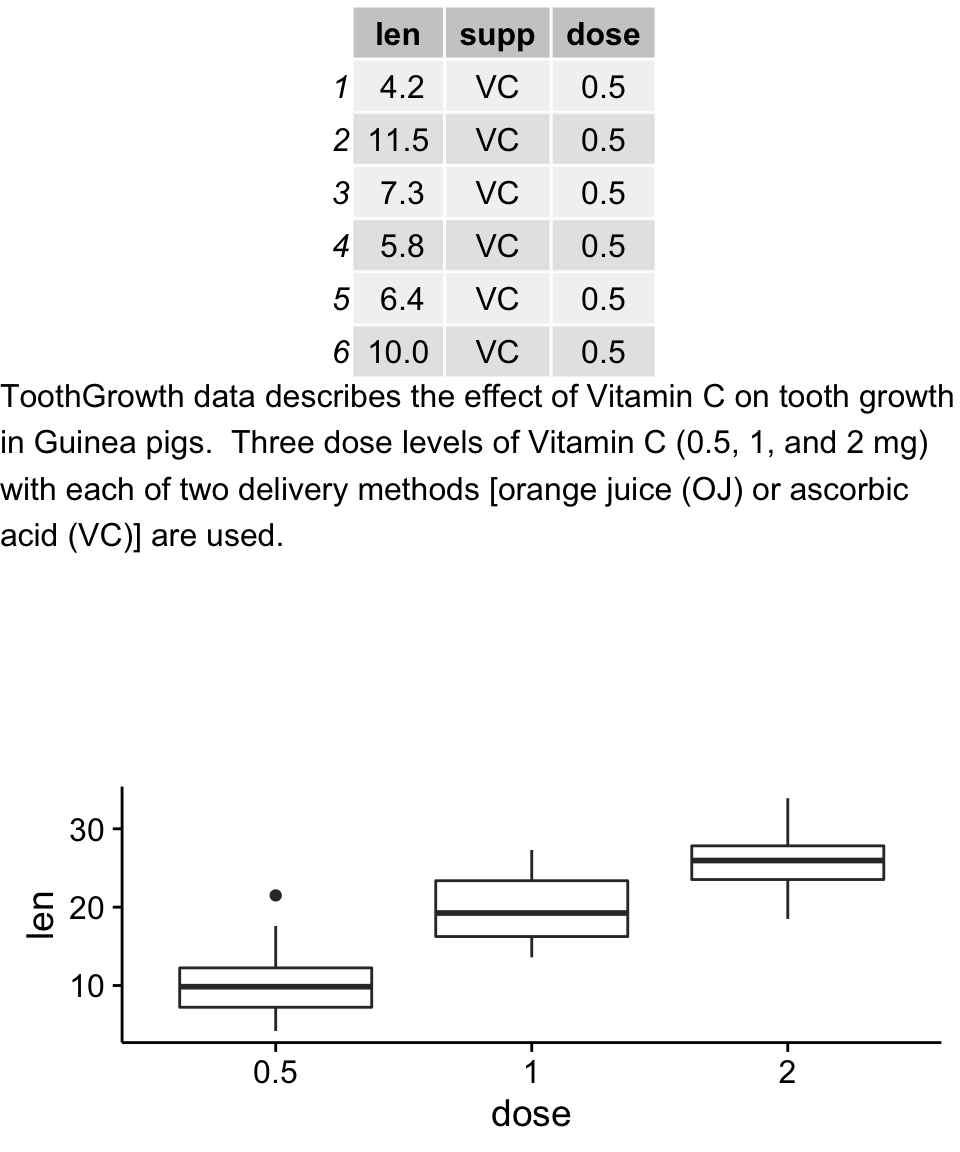
    以淀粉为原料生产葡萄的过程中, 残留许多糖蜜, 可作为生产酱色的原料. 在生产酱色的过程之前应尽可能彻彻底底除杂, 以保证酱色质量.为此对除杂方法进行选择. 在实验中选用5种不同的除杂方法, 每种方法做4次试验, 即重复4次, 结果见表.
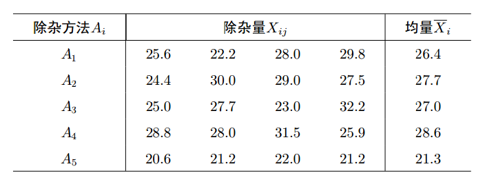
    1
    2
    3
    4
    5
    6
    7
    8
    9
    10
    11
    12
    13
    14
    15
    16
    17
    18
    19
    20
    21
    22
    23
    24
    25
    26
    27
    28
    29
    30
    31
    32
    33
    > X<-c(25.6, 22.2, 28.0, 29.8, 24.4, 30.0, 29.0, 27.5, 25.0, 27.7,
    23.0, 32.2, 28.8, 28.0, 31.5, 25.9, 20.6, 21.2, 22.0, 21.2)
    > A<-factor(rep(1:5, each=4))
    > miscellany<-data.frame(X, A)
    > miscellany
    X A
    1 25.6 1
    2 22.2 1
    3 28.0 1
    4 29.8 1
    5 24.4 2
    6 30.0 2
    7 29.0 2
    8 27.5 2
    9 25.0 3
    10 27.7 3
    11 23.0 3
    12 32.2 3
    13 28.8 4
    14 28.0 4
    15 31.5 4
    16 25.9 4
    17 20.6 5
    18 21.2 5
    19 22.0 5
    20 21.2 5
    > aov.mis<-aov(X~A, data=miscellany)
    > summary(aov.mis)
    Df Sum Sq Mean Sq F value Pr(>F)
    A 4 132.0 32.99 4.306 0.0162 *
    Residuals 15 114.9 7.66
    ---
    Signif. codes: 0 '***' 0.001 '**' 0.01 '*' 0.05 '.' 0.1 ' ' 1

    代码解释
    上述结果中, Df表示自由度; sum Sq表示平方和; Mean Sq表示均方和;
    F value表示F检验统计量的值, 即F比; Pr(>F)表示检验的p值; A就是因素A;
    Residuals为残差.
    可以看出, F = 4.3061 > F0.05(5-1, 20-5) = 3.06, 或者p=0.01618<0.05,
    说明有理由拒绝原假设, 即认为五种除杂方法有显著差异.
    2)如果有差别,判断是哪两组间有差别
    其中,上述所得结果为5个除杂方法之间的差异显著性分析,如果假设上述5中处理中A1为对照组,其余A2,A3,A4,A5均为处理组,现在若想分析一个对照和多个处理间的差异显著性,可以通过以下代码实现:

    1
    2
    3
    4
    5
    6
    7
    8
    9
    10
    11
    12
    13
    14
    15
    16
    > A1A2<-miscellany[1:8,]
    > A1A2
    X A
    1 25.6 1
    2 22.2 1
    3 28.0 1
    4 29.8 1
    5 24.4 2
    6 30.0 2
    7 29.0 2
    8 27.5 2
    > an.aov.mis<-aov(X~A, data=A1A2)
    > summary(an.aov.mis)
    Df Sum Sq Mean Sq F value Pr(>F)
    A 1 3.51 3.511 0.419 0.542
    Residuals 6 50.31 8.385

    即选取对照为一组数据,处理为另一组,缺点是对于多个处理一个对照需要重复此操作,现在还没找到好的处理办法,希望以后能学到或者有谁知道望相告。
    最近总结出的另一个比较有效的办法:
    接上aov()的F检验通过summary(aov.mis)看出五种除杂方法有显著差异.接下来考察具体的差异(多重比较)通过 TukeyHSD()函数:

    1
    2
    3
    4
    5
    6
    7
    8
    9
    10
    11
    12
    13
    14
    15
    16
    17
    18
    19
    20
    21
    22
    23
    24
    25
    26
    27
    28
    29
    30
    31
    32
    33
    34
    35
    36
    37
    38
    39
    40
    41
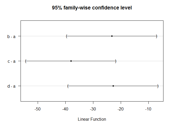
    42
      > TukeyHSD(aov.mis)
    Tukey multiple comparisons of means
    95% family-wise confidence level

    Fit: aov(formula = X ~ A, data = miscellany)

    $A
    diff lwr upr p adj
    2-1 1.325 -4.718582 7.3685818 0.9584566
    3-1 0.575 -5.468582 6.6185818 0.9981815
    4-1 2.150 -3.893582 8.1935818 0.8046644
    5-1 -5.150 -11.193582 0.8935818 0.1140537
    3-2 -0.750 -6.793582 5.2935818 0.9949181
    4-2 0.825 -5.218582 6.8685818 0.9926905
    5-2 -6.475 -12.518582 -0.4314182 0.0330240
    4-3 1.575 -4.468582 7.6185818 0.9251337
    5-3 -5.725 -11.768582 0.3185818 0.0675152
    5-4 -7.300 -13.343582 -1.2564182 0.0146983
    > miscellany
    X A
    1 25.6 1
    2 22.2 1
    3 28.0 1
    4 29.8 1
    5 24.4 2
    6 30.0 2
    7 29.0 2
    8 27.5 2
    9 25.0 3
    10 27.7 3
    11 23.0 3
    12 32.2 3
    13 28.8 4
    14 28.0 4
    15 31.5 4
    16 25.9 4
    17 20.6 5
    18 21.2 5
    19 22.0 5
    20 21.2 5
    #TukeyHSD图
    > plot(TukeyHSD(aov.mis))

    注意:可以看出上述结果是所有分组间的两两比较,但经常我们所需要的仅仅是一个对照组和其他几个处理组间的比较,这时multcomp包是不错的选择;
    Dunnett

    1
    2
    3
    4
    5
    6
    7
    8
    9
    10
    11
    12
    13
    14
    15
    16
    a = c(56,60,44,53)
    b = c(29,38,18,35)
    c = c(11,25,7,18)
    d = c(26,44,20,32)
    strains.frame = data.frame(a, b, c, d)
    strains = stack(strains.frame) #stack是reshape2包中的一个函数,用于将宽格式数据转化为长格式;
    colnames(strains) = c("weight", "group")
    ##常规的两两相互比较计算
    TukeyHSD( aov(weight ~ group, data=strains) )
    library(multcomp)
    summary(glht(aov(weight ~ group, data=strains), linfct=mcp(group="Dunnett")))
    ## The first group ("a" in this example) is used as the reference group.
    ## If this is not the case, use the relevel() command to set the reference.
    strains$group = relevel(strains$group, "b")
    summary(glht(aov(weight ~ group, data=strains), linfct=mcp(group="Dunnett")))
    plot(glht(aov(weight ~ group, data=strains), linfct=mcp(group="Dunnett")))


    More: http://barcwiki.wi.mit.edu/wiki/SOPs/anova
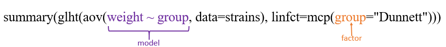
    multcomp包部分参数解释:
    glht:General Linear Hypotheses,General linear hypotheses and multiple comparisons for parametric models, including generalized linear models, linear mixed effects models, and survival models.
    linfct:a specification of the linear hypotheses to be tested,即指定之前的线性model将用于何种检验。
    mcp (Multiple comparisons):多重比较的意思,For each factor, which is included in model as independent variable, a contrast matrix or a symbolic description of the contrasts can be specified as arguments to mcp,其参数意思为Tukey’s all-pair comparisons or Dunnett’s comparison with a control.

    同样高效的办法:

    1
    2
    3
    4
    5
    6
    7
    8
    9
    10
    11
    12
    13
    14
    15
    16
    17
    18
    19
    20
    21
    22
    23
    24
    25
    26
    27
    28
    29
    30
    31
    32
    33
    34
    35
    36
    37
    > person <- rep(c(1:10),2)
    > treat <- c("A","B","A","A","B","B","A","B","A","B","B","A","B","B","A","A","B","A","B","A")
    > phase <- rep(c(1,2),each=10)
    > x <- c(760,860,568,780,960,940,635,440,528,800,770,855,602,800,958,952,650,450,530,803)
    > data46 <- data.frame(person,treat,phase,x)
    > data46$person<-factor(data46$person)
    > data46
    person treat phase x
    1 1 A 1 760
    2 2 B 1 860
    3 3 A 1 568
    4 4 A 1 780
    5 5 B 1 960
    6 6 B 1 940
    7 7 A 1 635
    8 8 B 1 440
    9 9 A 1 528
    10 10 B 1 800
    11 1 B 2 770
    12 2 A 2 855
    13 3 B 2 602
    14 4 B 2 800
    15 5 A 2 958
    16 6 A 2 952
    17 7 B 2 650
    18 8 A 2 450
    19 9 B 2 530
    20 10 A 2 803
    > result<-aov(x~phase+person+treat,data=data46)
    > summary(result)
    Df Sum Sq Mean Sq F value Pr(>F)
    phase 1 490 490 9.925 0.0136 *
    person 9 551111 61235 1240.195 1.32e-11 ***
    treat 1 198 198 4.019 0.0799 .
    Residuals 8 395 49
    ---
    Signif. codes: 0 ?**?0.001 ?*?0.01 ??0.05 ??0.1 ??1

    观察p adj值发现两两二者间的方差显著性.
    据上述结果可以填写下面的方差分析表:

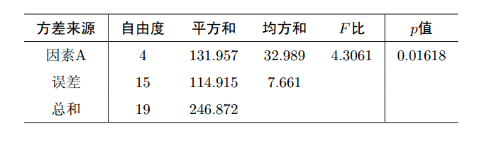
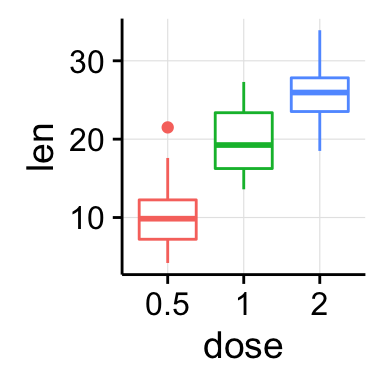
    再通过函数plot( )绘图可直观描述5种不同除杂方法之间的差异, R中运行命令

    1
    > plot(miscellany$X~miscellany$A)


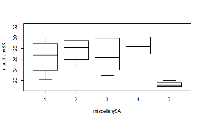
    从图形上也可以看出, 5种除杂方法产生的除杂量有显著差异, 特别第5种与前面的4种, 而方法1与3, 方法2与4的差异不
    明显.


    Contribution from :http://www.cnblogs.com/jpld/p/4594003.html

    bar

    Posted on 2015-10-08 | In R | Comments: | Views: ℃
    | Words count in article: | Reading time ≈

    The bar geom is used to produce 1d area plots: bar charts for categorical x, and histograms for continuous y. stat_bin explains the details of these summaries in more detail. In particular, you can use the weight aesthetic to create weighted histograms and barcharts where the height of the bar no longer represent a count of observations, but a sum over some other variable. See the examples for a practical example.

    Usage

    1
    geom_bar(mapping = NULL, data = NULL, stat = "bin", position = "stack", ...)

    Aesthetics

    geom_bar understands the following aesthetics (required aesthetics are in bold):

  • x
  • alpha
  • colour
  • fill
  • linetype
  • size
  • weight
  • Grouping Bars Together

    1
    2
    3
    4
    5
    6
    7
    8
    p<- ggplot(df2, aes(x=sample, y=high, fill=sample)) + 
    geom_bar(stat="identity",fill="lightblue", color="black",
    position=position_dodge()) +
    geom_errorbar(aes(ymin=high-sd, ymax=high+sd), width=.2,
    position=position_dodge(.9)) +
    theme(legend.position='none') +
    labs(title="Tooth length per dose", x="Sample", y = "high")
    print(p)

    代码解释
    aes中fill可指定不同类显示柱子颜色.
    geom_bar()的fill修改柱子填充颜色,color修改柱子外围颜色.
    theme()控制图例.
    labs()添加x,y轴和主题标签.

    1
    scale_fill_brewer(palette="Pastel1") #亦可用来修改柱子颜色

    在柱状图中使用不同颜色—把适当的变量映射到Fill中

    1
    2
    3
    4
    ggplot(upc, aes(x=reorder(Abb, Change), y=Change, fill=Region)) +
    geom_bar(stat="identity", colour="black") +
    scale_fill_manual(values=c("#669933", "#FFCC66")) +
    xlab("State")

    代码解释
    reorder函数,把柱状图按照大小排列.
    xlab()对x轴修改坐标轴注释.
    其方法随可以为不同柱子fill不同颜色,但所填充颜色是ggplot2系统自动生成,有时候颜色不好看想要修改为你自己制定的颜色,方法如下:
    方法1:breaks()

    1
    2
    3
    4
    5
    6
    7
    8
    9
    10
    11
    12
    13
    14
    15
    16
    MYdata <- data.frame(Age = rep(c(0,1,3,6,9,12), each=20),
    Richness = rnorm(120, 10000, 2500))
    ggplot(data = MYdata, aes(x = Age, y = Richness)) +
    geom_boxplot(aes(fill=factor(Age))) +
    geom_point(aes(color = factor(Age))) +
    scale_x_continuous(breaks = c(0, 1, 3, 6, 9, 12)) +
    scale_colour_manual(breaks = c("0", "1", "3", "6", "9", "12"),
    labels = c("0 month", "1 month", "3 months",
    "6 months", "9 months", "12 months"),
    values = c("#E69F00", "#56B4E9", "#009E73",
    "#F0E442", "#0072B2", "#D55E00")) +
    scale_fill_manual(breaks = c("0", "1", "3", "6", "9", "12"),
    labels = c("0 month", "1 month", "3 months",
    "6 months", "9 months", "12 months"),
    values = c("#E69F00", "#56B4E9", "#009E73",
    "#F0E442", "#0072B2", "#D55E00"))


    With this color scheme, the points that fall inside the boxplot are not visible (since they are the same color as the boxplot’s fill). Perhaps leaving the boxplot hollow and drawing its lines in the color would be better.

    1
    2
    3
    4
    5
    6
    7
    8
    9
    ggplot(data = MYdata, aes(x = Age, y = Richness)) + 
    geom_boxplot(aes(colour=factor(Age)), fill=NA) +
    geom_point(aes(color = factor(Age))) +
    scale_x_continuous(breaks = c(0, 1, 3, 6, 9, 12)) +
    scale_colour_manual(breaks = c("0", "1", "3", "6", "9", "12"),
    labels = c("0 month", "1 month", "3 months",
    "6 months", "9 months", "12 months"),
    values = c("#E69F00", "#56B4E9", "#009E73",
    "#F0E442", "#0072B2", "#D55E00"))


    代码解释
    操作自己数据时可能会出现报错 “Continuous value supplied to discrete scale” ,Brian Diggs大神给出的解释是:
    Age is a continuous variable, but you are trying to use it in a discrete scale (by specifying the color for specific values of age). In general, a scale maps the variable to the visual; for a continuous age, there is a corresponding color for every possible value of age, not just the ones that happen to appear in your data. However, you can simultaneously treat age as a categorical variable (factor) for some of the aesthetics. For the third part of your question, within the scale description, you can define specific labels corresponding to specific breaks in the scale.
    也就是要转换连续型变量为因子变量.
    方法2:Change the default palettes
    These are color-blind-friendly palettes, one with gray, and one with black.


    To use with ggplot2, it is possible to store the palette in a variable, then use it later.
    1
    2
    3
    4
    5
    6
    7
    8
    9
    10
    11
    # The palette with grey:
    cbPalette <- c("#999999", "#E69F00", "#56B4E9", "#009E73", "#F0E442", "#0072B2", "#D55E00", "#CC79A7")

    # The palette with black:
    cbbPalette <- c("#000000", "#E69F00", "#56B4E9", "#009E73", "#F0E442", "#0072B2", "#D55E00", "#CC79A7")

    # To use for fills, add
    scale_fill_manual(values=cbPalette)

    # To use for line and point colors, add
    scale_colour_manual(values=cbPalette)

    Coloring Negative and Postive Bars Differently—设定新的变量,将新建变量映射到fill中

    1
    2
    3
    4
    5
    csub <- subset(climate, Source=="Berkeley" & Year >= 1900)
    csub$pos <- csub$Anomaly10y >= 0
    ggplot(csub, aes(x=Year, y=Anomaly10y, fill=pos)) +
    geom_bar(stat="identity", position="identity", colour="black", size=0.25) +
    scale_fill_manual(values=c("#CCEEFF", "#FFDDDD"), guide=FALSE)


    代码解释
    首先通过subset()函数选取一个数集赋值到csub,选取原则为:climate数据中Source这一列值为Berkeley并且Year这一列>= 1900.
    csub$pos为原数集添加pos这一列,若Anomaly10y >= 0则其值为TRUE,否则为FALSE.

    1
    2
    3
    4
    5
    6
    7
    8
    9
    10
    11
    12
    13
    14
          Source Year Anomaly1y Anomaly5y Anomaly10y Unc10y   pos
    155 Berkeley 1954 NA NA -0.032 0.038 FALSE
    156 Berkeley 1955 NA NA -0.022 0.035 FALSE
    157 Berkeley 1956 NA NA 0.012 0.031 TRUE
    158 Berkeley 1957 NA NA 0.007 0.028 TRUE
    159 Berkeley 1958 NA NA 0.002 0.027 TRUE
    160 Berkeley 1959 NA NA 0.002 0.026 TRUE
    161 Berkeley 1960 NA NA -0.019 0.026 FALSE
    162 Berkeley 1961 NA NA -0.001 0.021 FALSE
    163 Berkeley 1962 NA NA 0.017 0.018 TRUE
    164 Berkeley 1963 NA NA 0.004 0.016 TRUE
    165 Berkeley 1964 NA NA -0.028 0.018 FALSE
    166 Berkeley 1965 NA NA -0.006 0.017 FALSE
    167 Berkeley 1966 NA NA -0.024 0.017 FALSE

    最后将pos映射到fill,geom_bar()中size改变柱子外框黑线的厚度.
    scale_fill_manual()进行修改颜色,通过设定guide=FALSE 去掉图例.
    geom_bar(width=0.5)调整width改变柱子宽度,也就是改变了柱子之间的距离.

    pylr改变图中堆积的颜色—order=desc()

    1
    2
    3
    library(plyr) # Needed for desc()
    ggplot(cabbage_exp, aes(x=Date, y=Weight, fill=Cultivar, order=desc(Cultivar))) +
    geom_bar(stat="identity")

    Making a Propotional Stacked Bar Graph

    1
    2
    3
    4
    5
    6
    7
    library(gcookbook) # For the data set
    library(plyr)
    # Do a group-wise transform(), splitting on "Date"
    ce <- ddply(cabbage_exp, "Date", transform,
    percent_weight = Weight / sum(Weight) * 100)
    ggplot(ce, aes(x=Date, y=percent_weight, fill=Cultivar)) +
    geom_bar(stat="identity")


    plyr里ddply的语法解析
    cabbage是数据集
    “Date” 通俗来说就是x轴的变量
    transform是要做的变形,在ddply中还有summarize等
    最后一项是是新建的变量和变型方法

    柱条上添加文字

    1
    2
    3
    4
    5
    6
    7
    8
    9
    10
    library(ggplot2)
    library(ggthemes)
    dt = data.frame(obj = c('A','D','B','E','C'), val = c(2,15,6,9,7))
    dt$obj = factor(dt$obj, levels=c('D','B','C','A','E')) ## 设置柱条的顺序
    p = ggplot(dt, aes(x = obj, y = val, fill = obj, group = factor(1))) +
    geom_bar(stat = "identity", width = 0.5) + ## 修改柱条的宽度
    theme_pander() +
    geom_text(aes(label = val, vjust = -0.8, hjust = 0.5, color = obj), show_guide = FALSE) + ## 显示柱条上的数字
    ylim(min(dt$val, 0)*1.1, max(dt$val)*1.1) ## 加大 Y 轴的范围,防止数字显示不齐全
    p


    代码解释
    ggthemes为ggplot2的一个主题包,通过theme_pander()修改ggplot2默认主题(theme).

    1
    dt$obj是因子类型,ggplot2作图时按照因子水平顺序来的,所以修改因子水平的顺序即可修改作图顺序,具体可以输出dt$obl.

    另一种改变柱子顺序方式:

    1
    p + scale_x_discrete(limits=c('D','B','C','A','E'))


    Contribution from :http://yangchao.me/2013/02/ggplot2-bar-chart/
    http://www.bubuko.com/infodetail-1051940.html
    http://stackoverflow.com/questions/10805643/ggplot2-add-color-to-boxplot-continuous-value-supplied-to-discrete-scale-er

    Icons

    Posted on 2015-10-07 | In Hexo | Comments: | Views: ℃
    | Words count in article: | Reading time ≈

    Setting up Font Awesome can be as simple as adding two lines of code to your website, or you can be a pro and
    customize the LESS yourself! Font Awesome even plays nicely withBootstrap 3!

    Paste the following code into the section of your site’s HTML.

    1
    <link rel="stylesheet" href="https://maxcdn.bootstrapcdn.com/font-awesome/4.4.0/css/font-awesome.min.css">

    如果font-awesome.min.css文件在本地,则按一下操作:

    进入 fontawesome下载字体和相应的CSS文件。


    找到下载压缩文件中的fonts和css文件夹,将其中内容拷贝到自己站点下。

    1
    2
    your blog address\themes\jacman\source\font   修改字体文件
    your blog address\jacman\source\css 修改字体相应的css

    following code into the section of your site’s HTML.

    1
    <link href="/css/font-awesome.min.css" rel="stylesheet">

    Examples

    Basic Icons

    fa-camera-retro

    1
    <i class="fa fa-camera-retro"></i> fa-camera-retro

    Larger Icons

    fa-lg
    fa-2x
    fa-3x
    fa-4x
    fa-5x

    1
    2
    3
    4
    5
    <i class="fa fa-camera-retro fa-lg"></i> fa-lg
    <i class="fa fa-camera-retro fa-2x"></i> fa-2x
    <i class="fa fa-camera-retro fa-3x"></i> fa-3x
    <i class="fa fa-camera-retro fa-4x"></i> fa-4x
    <i class="fa fa-camera-retro fa-5x"></i> fa-5x

    Fixed Width Icons

      Home
      Library
      Applications
      Settings

    1
    2
    3
    4
    5
    6
    <div class="list-group">
    <a class="list-group-item" href="#"><i class="fa fa-home fa-fw"></i>&nbsp; Home</a>
    <a class="list-group-item" href="#"><i class="fa fa-book fa-fw"></i>&nbsp; Library</a>
    <a class="list-group-item" href="#"><i class="fa fa-pencil fa-fw"></i>&nbsp; Applications</a>
    <a class="list-group-item" href="#"><i class="fa fa-cog fa-fw"></i>&nbsp; Settings</a>
    </div>

    List Icons

  • List icons

  • can be used

  • as bullets

  • in lists

  • 1
    2
    3
    4
    5
    6
    <ul class="fa-ul">
    <li><i class="fa-li fa fa-check-square"></i>List icons</li>
    <li><i class="fa-li fa fa-check-square"></i>can be used</li>
    <li><i class="fa-li fa fa-spinner fa-spin"></i>as bullets</li>
    <li><i class="fa-li fa fa-square"></i>in lists</li>
    </ul>

    Bordered & Pulled Icons


    …tomorrow we will run faster, stretch out our arms farther…
    And then one fine morning— So we beat on, boats against the
    current, borne back ceaselessly into the past.

    1
    2
    3
    4
    <i class="fa fa-quote-left fa-3x fa-pull-left fa-border"></i>
    ...tomorrow we will run faster, stretch out our arms farther...
    And then one fine morning— So we beat on, boats against the
    current, borne back ceaselessly into the past.

    Animated Icons


    1
    2
    3
    4
    5
    <i class="fa fa-spinner fa-spin"></i>
    <i class="fa fa-circle-o-notch fa-spin"></i>
    <i class="fa fa-refresh fa-spin"></i>
    <i class="fa fa-cog fa-spin"></i>
    <i class="fa fa-spinner fa-pulse"></i>

    Rotated & Flipped

    normal

    fa-rotate-90

    fa-rotate-180

    fa-rotate-270

    fa-flip-horizontal

    icon-flip-vertical

    1
    2
    3
    4
    5
    6
    <i class="fa fa-shield"></i> normal<br>
    <i class="fa fa-shield fa-rotate-90"></i> fa-rotate-90<br>
    <i class="fa fa-shield fa-rotate-180"></i> fa-rotate-180<br>
    <i class="fa fa-shield fa-rotate-270"></i> fa-rotate-270<br>
    <i class="fa fa-shield fa-flip-horizontal"></i> fa-flip-horizontal<br>
    <i class="fa fa-shield fa-flip-vertical"></i> icon-flip-vertical

    Stacked Icons


    fa-twitter on fa-square-o


    fa-flag on fa-circle


    fa-terminal on fa-square


    fa-ban on fa-camera

    1
    2
    3
    4
    5
    6
    7
    8
    9
    10
    11
    12
    13
    14
    15
    16
    17
    18
    19
    20
    <span class="fa-stack fa-lg">
    <i class="fa fa-square-o fa-stack-2x"></i>
    <i class="fa fa-twitter fa-stack-1x"></i>
    </span>
    fa-twitter on fa-square-o<br>
    <span class="fa-stack fa-lg">
    <i class="fa fa-circle fa-stack-2x"></i>
    <i class="fa fa-flag fa-stack-1x fa-inverse"></i>
    </span>
    fa-flag on fa-circle<br>
    <span class="fa-stack fa-lg">
    <i class="fa fa-square fa-stack-2x"></i>
    <i class="fa fa-terminal fa-stack-1x fa-inverse"></i>
    </span>
    fa-terminal on fa-square<br>
    <span class="fa-stack fa-lg">
    <i class="fa fa-camera fa-stack-1x"></i>
    <i class="fa fa-ban fa-stack-2x text-danger"></i>
    </span>
    fa-ban on fa-camera

    Bootstrap 3 Examples


    Delete


    Settings


    Font Awesome
    Version 4.4.0


    User


    • Edit

    • Delete

    • Ban

    • Make admin


    1
    2
    3
    4
    5
    6
    7
    8
    9
    10
    11
    12
    13
    14
    15
    16
    17
    18
    19
    20
    21
    22
    23
    24
    25
    26
    27
    28
    29
    30
    31
    32
    33
    34
    35
    <a class="btn btn-danger" href="#">
    <i class="fa fa-trash-o fa-lg"></i> Delete</a>
    <a class="btn btn-default btn-sm" href="#">
    <i class="fa fa-cog"></i> Settings</a>

    <a class="btn btn-lg btn-success" href="#">
    <i class="fa fa-flag fa-2x pull-left"></i> Font Awesome<br>Version 4.4.0</a>

    <div class="btn-group">
    <a class="btn btn-default" href="#"><i class="fa fa-align-left"></i></a>
    <a class="btn btn-default" href="#"><i class="fa fa-align-center"></i></a>
    <a class="btn btn-default" href="#"><i class="fa fa-align-right"></i></a>
    <a class="btn btn-default" href="#"><i class="fa fa-align-justify"></i></a>
    </div>

    <div class="input-group margin-bottom-sm">
    <span class="input-group-addon"><i class="fa fa-envelope-o fa-fw"></i></span>
    <input class="form-control" type="text" placeholder="Email address">
    </div>
    <div class="input-group">
    <span class="input-group-addon"><i class="fa fa-key fa-fw"></i></span>
    <input class="form-control" type="password" placeholder="Password">
    </div>

    <div class="btn-group open">
    <a class="btn btn-primary" href="#"><i class="fa fa-user fa-fw"></i> User</a>
    <a class="btn btn-primary dropdown-toggle" data-toggle="dropdown" href="#">
    <span class="fa fa-caret-down"></span></a>
    <ul class="dropdown-menu">
    <li><a href="#"><i class="fa fa-pencil fa-fw"></i> Edit</a></li>
    <li><a href="#"><i class="fa fa-trash-o fa-fw"></i> Delete</a></li>
    <li><a href="#"><i class="fa fa-ban fa-fw"></i> Ban</a></li>
    <li><a href="#"><i class="i"></i> Make admin</a></li>
    </ul>
    </div>

    Contribution from :http://fontawesome.io/examples/

    为图形添加文本

    Posted on 2015-10-05 | In R | Comments: | Views: ℃
    | Words count in article: | Reading time ≈
    1
    2
    3
    4
    5
    6
    7
    8
    9
    10
    11
    12
    13
    14
    15
    16
    17
    18
    19
    20
    21
    22
    23
    24
    25
    26
    27
    28
    29
    30
    31
    32
    33
    34
    35
    36
    37
    38
    39
    40
    41
    42
    43
    44
    45
    46
    47
    48
    49
    50
    51
    52
    53
    54
    55
    56
    57
    58
    59
    60
    61
    62
    63
    64
    > text1<-read.delim("fun.txt",header=FALSE)
    > text1
    V1
    1 INFORMATION STORAGE AND PROCESSING
    2 [J] Translation, ribosomal structure and biogenesis
    3 [A] RNA processing and modification
    4 [K] Transcription
    5 [L] Replication, recombination and repair
    6 [B] Chromatin structure and dynamics
    7 CELLULAR PROCESSES AND SIGNALING
    8 [D] Cell cycle control, cell division, chromosome partitioning
    9 [Y] Nuclear structure
    10 [V] Defense mechanisms
    11 [T] Signal transduction mechanisms
    12 [M] Cell wall/membrane/envelope biogenesis
    13 [N] Cell motility
    14 [Z] Cytoskeleton
    15 [W] Extracellular structures
    16 [U] Intracellular trafficking, secretion, and vesicular transport
    17 [O] Posttranslational modification, protein turnover, chaperones
    18 METABOLISM
    19 [C] Energy production and conversion
    20 [G] Carbohydrate transport and metabolism
    21 [E] Amino acid transport and metabolism
    22 [F] Nucleotide transport and metabolism
    23 [H] Coenzyme transport and metabolism
    24 [I] Lipid transport and metabolism
    25 [P] Inorganic ion transport and metabolism
    26 [Q] Secondary metabolites biosynthesis, transport and catabolism
    27 POORLY CHARACTERIZED
    28 [R] General function prediction only
    29 [S] Function unknown
    > a<-c("a","b","c");
    > b<-c(1,2,3);
    > c<-c(4,6,7);
    > abc<-data.frame(a,b,c);
    > abc;
    a b c
    1 a 1 4
    2 b 2 6
    3 c 3 7
    > library(reshape2);
    > agcd<-melt(abc,id.vars="a",value.name="value",variable.name="bq");
    > len<-nrow(text1);
    > a1<-agcd[,1];
    > b1<-agcd[,3];
    > library(ggplot2);
    > library(grid);
    > vp1<-viewport(width=0.6,height=1,x=0.3,y=0.5);
    > pm<-ggplot(agcd,aes(a1,weight=value,fill=bq))+geom_bar(position="dodge")+theme(legend.title=element_blank(),legend.position=c(0.1,0.9))+xlab("COG")+ylab("M82/smithella and M82/SB");
    #之上为画图部分,下面开始绘制文本
    > par(fig=c(0.55,1,0,1),bty="n");
    > b<-20;
    > plot(1:b,1:b,type="n",xaxt="n",yaxt="n",xlab="",ylab="");
    > sum=b+b/(2*len);
    > for(i in 1:(len)){
    + if (i %in% c(1,7,18,27) ){
    + text(1,sum,text1[i,],adj=0,cex=0.8,font=2);
    + sum=sum-b/(len);
    + }else{
    + text(1,sum,text1[i,],adj=0,cex=0.8);
    + sum=sum-b/(len);}}
    #将图形和文本合并
    > print(pm,vp=vp1);

    关键点解释

    设置图形参数—函数par()

    1
    2
    3
    4
    5
    6
    7
    adj:设定在text、mtext、title中字符串的对齐方向。0表示左对齐,0.5(默认值)表示居中,而1表示右对齐。
    ann:如果ann=FALSE,那么高水平绘图函数会调用函数plot.default使对坐标轴名称、整体图像名称不做任何注解。
    bty:用于限定图形的边框类型。如果bty的值为"o"(默认值)、"l"、"7"、"c"、"u"或者"]"中的任意一个,对应的边框类型就和该字母的形状相似,"n",表示无边框。
    fig: c(x1, x2, y1, y2),设定当前图形在绘图设备中所占区域,需要满足x1<x2,y1<y2。如果修改参数fig,会自动打开一个新的绘图设备,而若希望在原来的绘图设备中添加新的图形,需要和参数new=TRUE一起使用。
    fin:当前绘图区域的尺寸规格,形式为(width,height)。
    lty:直线类型。参数的值可以为整数(0为空,1为实线(默认值),2为虚线,3为点线。
    oma:参数形式为c(bottom, left, top, right) ,用于设定外边界。


    melt()

    1
    2
    id.vars 是被当做维度的列变量,每个变量在结果中占一列;
    measure.vars 是被当成观测值的列变量,它们的列变量名称和值分别组成 variable 和 value两列,列变量名称用variable.name 和 value.name来指定。

    position()

    1
    2
    3
    4
    5
    6
    geom_bar(position="dodge")调整条形图排列方式,可选参数为"dodge,fill,identity,jitter,stack"。legend.position调整图例位置。
    dodge:"避让"方式,即往旁边闪,如柱形图的并排方式就是这种
    fill:填充方式, 先把数据归一化,再填充到绘图区的顶部
    identity:原地不动,不调整位置
    jitter:随机抖一抖,让本来重叠的露出点头来
    stack:叠罗汉

    1
    b<-20;为自定义值,根据图形微调。
    1
    1,7,18,27为文本文件中特殊行。

    附加

    通过设置par()绘制一页多图

    1
    2
    3
    4
    5
    6
    7
    8
    9
    10
    attach(mtcars)
    opar<-par(no.readonly=T)
    par(fig=c(0,0.8,0,0.8))
    plot(wt,mpg,xlab="Miles per Gallon",ylab="car weight")
    par(fig=c(0,0.8,0.55,1),new=T)
    boxplot(wt,horizontal=T,axes=F)
    par(fig=c(0.65,1,0,0.8),new=T)
    boxplot(mpg,axes=F)
    par(opar)
    detach(mtcars)

    Contribution from :http://www.dataguru.cn/article-4827-1.html

    R中分组统计函数

    Posted on 2015-10-05 | In R | Comments: | Views: ℃
    | Words count in article: | Reading time ≈

    apply(对一个数组按行或者按列进行计算)

    使用格式为:

    1
    apply(X, MARGIN, FUN, ...)

    其中X为一个数组;MARGIN为一个向量(表示要将函数FUN应用到X的行还是列),若为1表示取行,为2表示取列,为c(1,2)表示行、列都计算。

    1
    2
    3
    4
    5
    6
    7
    8
    9
    10
    11
    12
    13
    > ma <- matrix(c(1:4, 1, 6:8), nrow = 2)
    > ma
    [,1] [,2] [,3] [,4]
    [1,] 1 3 1 7
    [2,] 2 4 6 8
    > apply(ma, c(1,2), sum)
    [,1] [,2] [,3] [,4]
    [1,] 1 3 1 7
    [2,] 2 4 6 8
    > apply(ma, 1, sum)
    [1] 12 20
    > apply(ma, 2, sum)
    [1] 3 7 7 15

    tapply(分组统计)

    使用格式为:

    1
    tapply(X, INDEX, FUN = NULL, ..., simplify = TRUE)

    其中X通常是一向量;
    INDEX是一个list对象,且该list中的每一个元素都是与X有同样长度的因子;
    FUN是需要计算的函数;
    simplify是逻辑变量,若取值为TRUE(默认值),且函数FUN的计算结果总是为一个标量值,那么函数tapply返回一个数组;
    若取值为FALSE,则函数tapply的返回值为一个list对象。
    需要注意的是,当第二个参数INDEX不是因子时,函数 tapply() 同样有效,因为必要时 R 会用 as.factor()把参数强制转换成因子。

    1
    2
    3
    4
    5
    6
    7
    8
    9
    10
    11
    12
    13
    14
    15
    16
    17
    18
    19
    20
    > a<-data.frame(name=c("tom","sam","mik","ali"),age=c(8,9,8,9),math=c(50,100,70,90),verbal=c(90,60,96,80))
    > a
    name age math verbal
    1 tom 8 50 90
    2 sam 9 100 60
    3 mik 8 70 96
    4 ali 9 90 80
    > ages<-levels(as.factor(a$age))
    > ages
    [1] "8" "9"
    > b<-matrix(nrow=length(ages),ncol=2)
    > rownames(b)<-ages
    > colnames(b)<-c("math","verbal")
    > for(i in 1:2){
    + b[,i]<-tapply(a[,i+2],a[,"age"],mean) #tapply的排序方法是输入factor的levels.
    + }
    > b
    math verbal
    8 60 93
    9 95 70

    table(因子出现的频数)

    使用格式为:

    1
    2
    table(..., exclude = if (useNA == "no") c(NA, NaN), useNA = c("no",
    "ifany", "always"), dnn = list.names(...), deparse.level = 1)

    其中参数exclude表示哪些因子不计算。

    1
    2
    3
    4
    5
    6
    7
    8
    9
    10
    11
    12
    > d <- factor(rep(c("A","B","C"), 10), levels=c("A","B","C","D","E"))
    > d
    [1] A B C A B C A B C A B C A B C A B C A B C A B C A B C A B C
    Levels: A B C D E
    > table(d)
    d
    A B C D E
    10 10 10 0 0
    > table(d, exclude="B")
    d
    A C D E
    10 10 0 0

    R作图--坐标中断(axis breaks)-- plotrix

    Posted on 2015-10-05 | In R | Comments: | Views: ℃
    | Words count in article: | Reading time ≈

    R当中的坐标中断一般都使用plotrix库中的axis.break(), gap.plot(), gap.barplot(), gap.boxplot()等几个函数来实现.

    axis.break

    1
    2
    3
    4
    5
    6
    7
    8
    9
    library(plotrix)
    opar<-par(mfrow=c(1,3))
    plot(sample(5:7,20,replace=T),main="Axis break test of gap",ylim=c(2,8))
    axis.break(axis=2,breakpos=3.5,breakcol="red",style="gap")
    plot(sample(5:7,20,replace=T),main="Axis break test of slash",ylim=c(2,8))
    axis.break(axis=2,breakpos=3.5,breakcol="red",style="slash")
    plot(sample(5:7,20,replace=T),main="Axis break test of zigzag",ylim=c(2,8))
    axis.break(axis=2,breakpos=3.5,breakcol="red",style="zigzag")
    par(opar)

    parameters

    1
    2
    3
    4
    5
    6
    7
    8
    9
    axis.break(axis=1,breakpos=NULL,pos=NA,bgcol="white",breakcol="black",
    style="slash",brw=0.02)
    axis: which axis to break,1=x轴,2=y轴,3=顶端x轴,4=右y轴
    breakpos:where to place the break in user units
    pos: position of the axis (see axis)
    bgcol: the color of the plot background
    breakcol:the color of the "break" marker
    style: Either gap, slash or zigzag
    brw: break width relative to plot width

    gap.plot

    1
    2
    3
    4
    5
    6
    7
    8
    9
    10
    11
    12
    13
    14
    15
    16
    17
    opar<-par(mfrow=c(1,3))
    twogrp<-c(rnorm(5)+4,rnorm(5)+20,rnorm(5)+5,rnorm(5)+22)
    gap.plot(twogrp,gap=c(8,16,25,35),
    xlab="X values",ylab="Y values",xlim=c(1,30),ylim=c(0,45),
    main="Test two gap plot with the lot",xtics=seq(0,30,by=5),
    ytics=c(4,6,18,20,22,38,40,42),
    lty=c(rep(1,10),rep(2,10)),
    pch=c(rep(2,10),rep(3,10)),
    col=c(rep(2,10),rep(3,10)),
    type="b")
    gap.plot(21:30,rnorm(10)+40,gap=c(8,16,25,35),add=TRUE,
    lty=rep(3,10),col=rep(4,10),type="l")
    gap.barplot(twogrp,gap=c(8,16),xlab="Index",ytics=c(3,6,17,20),
    ylab="Group values",main="Barplot with gap")
    gap.barplot(twogrp,gap=c(8,16),xlab="Index",ytics=c(3,6,17,20),
    ylab="Group values",horiz=TRUE,main="Horizontal barplot with gap")
    par(opar)


    1
    2
    3
    4
    5
    6
    7
    opar<-par(mfrow=c(1,2))
    twovec<-list(vec1=c(rnorm(30),-6),vec2=c(sample(1:10,40,TRUE),20))
    gap.boxplot(twovec,gap=list(top=c(12,18),bottom=c(-5,-3)),
    main="Show outliers separately")
    gap.boxplot(twovec,gap=list(top=c(12,18),bottom=c(-5,-3)),range=0,
    main="Include outliers in whiskers")
    par(opar)


    1
    2
    3
    4
    twogrp<-c(rnorm(5)+4,rnorm(5)+20,rnorm(5)+5,rnorm(5)+22)
    gpcol<-c(2,2,2,2,2,3,3,3,3,3,4,4,4,4,4,5,5,5,5,5)
    gap.plot(twogrp,gap=c(8,16),xlab="Index",ylab="Group values", main="E ",col=gpcol)
    legend(19, 9.5, c("2","3","4","5"), pch = 1, col = 2:5)

    parameters

    1
    2
    3
    4
    5
    6
    7
    8
    9
    10
    11
    12
    13
    14
    15
    16
    17
    18
    19
    20
    gap.plot(x,y,gap,gap.axis="y",bgcol="white",breakcol="black",brw=0.02,xlim=range(x),ylim=range(y),
    xticlab,xtics=NA,yticlab,ytics=NA,lty=rep(1,length(x)),col=rep(par("col"),length(x)),
    pch=rep(1,length(x)),add=FALSE,stax=FALSE,...)

    x,y: data values
    gap: the range(s) of values to be left out 省略的轴
    gap.axis: whether the gaps are to be on the x or y axis 在哪个轴上省略
    bgcol: the color of the plot background
    breakcol: the color of the "break" marker
    brw: break width relative to plot width
    xlim,ylim:the plot limits.
    xticlab: labels for the x axis ticks
    xtics: position of the x axis ticks #x轴显示的表号
    yticlab: labels for the y axis ticks
    ytics: position of the y axis ticks
    lty: line type(s) to use if there are lines
    col: color(s) in which to plot the values
    pch: symbols to use in plotting.
    add: whether to add values to an existing plot.
    stax: whether to call staxlab for staggered axis labels.

    gap.barplot

    使用gap.plot, gap.barplot, gap.boxplot之后重新使用axis.break来修改中断类型,使得看上去美一点,
    并绘制出双反斜线中断,可以视实际情况延伸断点起止位置.

    1
    2
    3
    4
    5
    6
    7
    8
    9
    10
    11
    12
    13
    14
    15
    16
    17
    18
    19
    20
    21
    22
    23
    library(plotrix)
    opar<-par(mfrow=c(2,2))
    x<-c(1:5,6.9,7)
    y<-2^x
    from<-33
    to<-110
    plot(x,y,type="b",main="normal plot")
    gap.plot(x,y,gap=c(from,to),type="b",main="gap plot")
    axis.break(2,from,breakcol="red",style="gap")
    axis.break(2,from*(1+0.02),breakcol="black",style="slash")
    axis.break(4,from*(1+0.02),breakcol="black",style="slash")
    axis(2,at=from)
    gap.barplot(y,gap=c(from,to),col=as.numeric(x),main="barplot with gap")
    axis.break(2,from,breakcol="red",style="gap")
    axis.break(2,from*(1+0.02),breakcol="black",style="slash")
    axis.break(4,from*(1+0.02),breakcol="black",style="slash")
    axis(2,at=from)
    gap.barplot(y,gap=c(from,to),col=as.numeric(x),horiz=T,main="Horizontal barplot with gap")
    axis.break(1,from,breakcol="red",style="gap")
    axis.break(1,from*(1+0.02),breakcol="black",style="slash")
    axis.break(3,from*(1+0.02),breakcol="black",style="slash")
    axis(1,at=from)
    par(opar)


    如果画图过程中困惑了,记得重新来看一下内容,有惊喜:

    1
    2
    3
    4
    5
    6
    7
    8
    9
    10
    11
    12
    13
    14
    15
    16
    17
    18
    19
    x1=c(3,5,6,9,375,190);
    x1
    x2=c(2,2,3,30,46,60);
    x2
    data=rbind(x1,x2);
    data
    colnames(data)=c("Pig","Layer","Broiler","Dairy","Beef","Sheep")
    rownames(data)=c("1980","2010")
    data
    library(plotrix)
    newdata<-data
    newdata[newdata>200]<-newdata[newdata>200]-150
    newdata
    barpos<-barplot(newdata,names.arg=colnames(newdata),
    ylim=c(0,250),beside=TRUE,col=c("darkblue","red"),axes=FALSE)
    axis(2,at=c(0,50,100,150,200,235),
    labels=c(0,50,100,150,200,375))
    box()
    axis.break(2,210,style="gap")


    Contribution from :http://www.dataguru.cn/article-4827-1.html

    Modify the coordinates

    Posted on 2015-10-03 | In R | Comments: | Views: ℃
    | Words count in article: | Reading time ≈

    修改坐标的函数

    修改坐标的这类属性,要用到theme()函数:

    1
    2
    gg<-ggplot(diamonds[1:20,])
    gg+geom_bar(aes(price,fill=cut)) + theme(axis.text.x=element_text(family="myFont2",face="bold",size=10,angle=45,color="red"))

    效果:

    解释:

    凡事要修改坐标文字的格式,都加一句来修改:

    1
    theme(axis.text.x=theme_text(X轴属性),asix.text.y=theme_text(Y轴属性))

    theme_text()是存储文字属性的函数,其内置属性如下:

    1
    2
    3
    4
    5
    family:字体
    face:粗体、斜体等
    size:字体大小
    angle:倾斜角度
    color:颜色

    修改字体

    提前设置一下字体:

    1
    windowsFonts(myFont1=windowsFont("Times New Roman"),myFont2=windowsFont("宋体"))

    然后才可以用family来修改字体

    1
    Family="myfont1"

    修改字体粗细

    Face可以设置的属性有以下几个:

    1
    2
    3
    4
    plain:普通
    italic:斜体
    bold:粗体
    bold.italic:粗体+斜体

    修改尺寸大小

    用数字代表字体大小即可,普通的字体可以设置为

    1
    size=8

    修改角度

    1
    angle=45

    表示字体逆时针倾斜45°,范围是0-360

    修改颜色

    用color或者colour都可以修改颜色,颜色用关键字来表示,或者用十六进制的颜色代码来表示

    详细说明http://blog.csdn.net/bone_ace/article/details/47362619
    http://www.cookbook-r.com/Graphs/Colors_(ggplot2)/

    修改位置

    修改位置用下面的参数:

    1
    2
    3
    hjust:调整横向位置
    vjust:调整纵向位置
    上面都设置数字,一般调整0.5左右,可以是负值

    修改刻度标签

    1
    2
    3
    4
    xname<-c("a","b")
    p<- ggplot(data, aes(x=name, y=high),xaxt="n")+
    scale_y_discrete(labels=xname)
    scale_x_discrete(labels=xname)

    scale_xx_manual(values=c(a,b,c))对ggplot2自动设置aes()进行修改,xx可以是aes()包括的fill,colour,shape.

    legend图例的修改


    ggplot2中的legend包括四个部分:legend.tittle, legend.text, legend.key, legend.backgroud。针对每一部分有四种处理方式:
    element_text()绘制标签和标题,可控制字体的family, face, colour, size, hjust, vjust, angle, lineheight,当改变角度时,序将hjust调整至0或1.
    element_rect()绘制主要供背景使用的矩形,你可以控制颜色的填充(fill)和边界的colour, size, linetype
    element_blank()表示空主题,即对元素不分配相应的绘图空间。该函数可以山区我们不感兴趣的绘图元素。使用之前的colour=NA,fill=NA,让某些元素不可见,但仍然占绘图空间。
    element_get()可得到当前主题的设置。
    theme()可在一幅图中对某些元素进行局部性修改,theme_update()可为后面图形的绘制进行全局性的修改
    不加Legend

    1
    p+theme(legend.title=element_blank())

    图例(legend)的位置

    1
    p+theme(legend.position="left")

    图例(legend)的位置和对齐使用的主题设置legend.position来控制,其值可为right,left,top,bottom,none。
    修改legend.tittle内容

    1
    2
    3
    4
    p+scale_colour_hue(name="what does it eat?",breaks=c("herbi","carni","omni",NA),labels=c("plants","meat","both","don't know"))
    注:name定义标签标题(legend.tittle)
    breaks为标签原内容(legend.text)
    labels为自定义后的标签内容(legend.text)

    修改尺寸大小

    1
    2
    3
    4
    p+theme(legend.background=element_rect(colour="purple",fill="pink",size=3,linetype="dashed"));
    p+theme(legend.key.size=unit(2,'cm'));
    p+theme(legend.key.width=unit(5,'cm'));
    p+theme(legend.text = element_text(colour = 'red', angle = 45, size = 10, hjust = 3, vjust = 3, face = 'bold'))

    报错:could not find function “unit”
    解决办法:library(grid)
    颜色的修改以及一致性

    1
    2
    3
    4
    library(RColorBrewer);
    newpalette<-colorRampPalette(brewer.pal(12,"Set3"))(length(unique(eee$name)));
    p+scale_fill_manual(values=newpalette);
    p+geom_bar(position="stack",aes(order=desc(name)))

    更多图例修改:https://github.com/hadley/ggplot2/wiki/Legend-Attributes

    修改坐标轴的显示范围

    1
    gg+geom_line(aes(depth,price,color=cut,alpha=1/3),size=2) +labs(title="example")


    1
    2
    3
    gg+geom_line(aes(depth,price,color=cut,alpha=1/3),size=2) +
    labs(title="example") +
    scale_x_continuous(limits=c(60,64))

    修改坐标的显示刻度

    1
    2
    3
    4
    gg+geom_line(aes(depth,price,color=cut,alpha=1/3),size=2) +
    labs(title="example") +
    scale_x_continuous(limits=c(60,64)) +
    theme(axis.text.x=element_text(angle=45,size=5))


    修改坐标轴显示间隔用到breaks参数,并且要用seq(起始值,终止值,间隔)函数来设置间隔

    1
    2
    3
    4
    gg+geom_line(aes(depth,price,color=cut,alpha=1/3),size=2) +
    labs(title="example") +
    scale_x_continuous(limits=c(60,64),breaks=seq(60,64,2)) +
    theme(axis.text.x=element_text(angle=45,size=5))


    Contribution from :http://blog.sina.com.cn/s/blog_670445240102v250.html

    Mix multiple graphs on the same page

    Posted on 2015-10-03 | In R | Comments: | Views: ℃
    | Words count in article: | Reading time ≈

    Easy way to mix multiple graphs on the same page - R software and data visualization

    Install and load required packages

    1
    2
    3
    4
    install.packages("gridExtra")
    library("gridExtra")
    install.packages("cowplot")
    library("cowplot")

    Prepare some data

    1
    2
    3
    4
    5
    6
    7
    8
    9
    10
    11
    df <- ToothGrowth
    # Convert the variable dose from a numeric to a factor variable
    df$dose <- as.factor(df$dose)
    head(df)
    ## len supp dose
    ## 1 4.2 VC 0.5
    ## 2 11.5 VC 0.5
    ## 3 7.3 VC 0.5
    ## 4 5.8 VC 0.5
    ## 5 6.4 VC 0.5
    ## 6 10.0 VC 0.5

    Cowplot: Publication-ready plots

    The cowplot package is an extension to ggplot2 and it can be used to provide a publication-ready plots.

    Basic plots

    1
    2
    3
    4
    5
    6
    7
    8
    9
    library(cowplot)
    # Default plot
    bp <- ggplot(df, aes(x=dose, y=len, color=dose)) +
    geom_boxplot() +
    theme(legend.position = "none")
    bp

    # Add gridlines
    bp + background_grid(major = "xy", minor = "none")


    Recall that, the function ggsave()[in ggplot2 package] can be used to save ggplots. However, when working with cowplot, the function save_plot() [in cowplot package] is preferred. It’s an alternative to ggsave with a better support for multi-figur plots.

    1
    2
    3
    save_plot("mpg.pdf", plot.mpg,
    base_aspect_ratio = 1.3 # make room for figure legend
    )

    Arranging multiple graphs using cowplot

    1
    2
    3
    4
    5
    6
    7
    8
    9
    10
    # Scatter plot
    sp <- ggplot(mpg, aes(x = cty, y = hwy, colour = factor(cyl)))+
    geom_point(size=2.5)
    sp

    # Bar plot
    bp <- ggplot(diamonds, aes(clarity, fill = cut)) +
    geom_bar() +
    theme(axis.text.x = element_text(angle=70, vjust=0.5))
    bp


    Combine the two plots (the scatter plot and the bar plot):

    1
    plot_grid(sp, bp, labels=c("A","B"), ncol = 2, nrow = 1)


    The function draw_plot() can be used to place graphs at particular locations with a particular sizes. The format of the function is:

    1
    draw_plot(plot, x = 0, y = 0, width = 1, height = 1)

    • plot: the plot to place (ggplot2 or a gtable)
    • x: The x location of the lower left corner of the plot.
    • y: The y location of the lower left corner of the plot.
    • width, height: the width and the height of the plot


    • The function ggdraw() is used to initialize an empty drawing canvas.
      1
      2
      3
      4
      5
      6
      7
      8
      9
      10
      plot.iris <- ggplot(iris, aes(Sepal.Length, Sepal.Width)) + 
      geom_point() + facet_grid(. ~ Species) + stat_smooth(method = "lm") +
      background_grid(major = &#39;y&#39;, minor = "none") + # add thin horizontal lines
      panel_border() # and a border around each panel
      # plot.mpt and plot.diamonds were defined earlier
      ggdraw() +
      draw_plot(plot.iris, 0, .5, 1, .5) +
      draw_plot(sp, 0, 0, .5, .5) +
      draw_plot(bp, .5, 0, .5, .5) +
      draw_plot_label(c("A", "B", "C"), c(0, 0, 0.5), c(1, 0.5, 0.5), size = 15)

      grid.arrange: Create and arrange multiple plots

      The R code below creates a box plot, a dot plot, a violin plot and a stripchart (jitter plot) :

      1
      2
      3
      4
      5
      6
      7
      8
      9
      10
      11
      12
      13
      14
      15
      16
      17
      18
      19
      20
      21
      22
      23
      24
      library(ggplot2)
      # Create a box plot
      bp <- ggplot(df, aes(x=dose, y=len, color=dose)) +
      geom_boxplot() +
      theme(legend.position = "none")

      # Create a dot plot
      # Add the mean point and the standard deviation
      dp <- ggplot(df, aes(x=dose, y=len, fill=dose)) +
      geom_dotplot(binaxis=&#39;y&#39;, stackdir=&#39;center&#39;)+
      stat_summary(fun.data=mean_sdl, mult=1,
      geom="pointrange", color="red")+
      theme(legend.position = "none")

      # Create a violin plot
      vp <- ggplot(df, aes(x=dose, y=len)) +
      geom_violin()+
      geom_boxplot(width=0.1)

      # Create a stripchart
      sc <- ggplot(df, aes(x=dose, y=len, color=dose, shape=dose)) +
      geom_jitter(position=position_jitter(0.2))+
      theme(legend.position = "none") +
      theme_gray()

      Combine the plots using the function grid.arrange() [in gridExtra] :

      1
      2
      3
      library(gridExtra)
      grid.arrange(bp, dp, vp, sc, ncol=2,
      main="Multiple plots on the same page")

      Add a common legend for multiple ggplot2 graphs

      This can be done in four simple steps :

      1. Create the plots : p1, p2, ….
      2. Save the legend of the plot p1 as an external graphical element (called a “grob” in Grid terminology)
      3. Remove the legends from all plots
      4. Draw all the plots with only one legend in the right panel


      5. To save the legend of a ggplot, the helper function below can be used :
        1
        2
        3
        4
        5
        6
        7
        library(gridExtra)
        get_legend<-function(myggplot){
        tmp <- ggplot_gtable(ggplot_build(myggplot))
        leg <- which(sapply(tmp$grobs, function(x) x$name) == "guide-box")
        legend <- tmp$grobs[[leg]]
        return(legend)
        }

        (The function above is derived from this forum. )

        1
        2
        3
        4
        5
        6
        7
        8
        9
        10
        11
        12
        13
        14
        15
        16
        17
        18
        19
        20
        21
        22
        # 1. Create the plots
        #++++++++++++++++++++++++++++++++++
        # Create a box plot
        bp <- ggplot(df, aes(x=dose, y=len, color=dose)) +
        geom_boxplot()

        # Create a violin plot
        vp <- ggplot(df, aes(x=dose, y=len, color=dose)) +
        geom_violin()+
        geom_boxplot(width=0.1)+
        theme(legend.position="none")

        # 2. Save the legend
        #+++++++++++++++++++++++
        legend <- get_legend(bp)

        # 3. Remove the legend from the box plot
        #+++++++++++++++++++++++
        bp <- bp + theme(legend.position="none")

        # 4. Arrange ggplot2 graphs with a specific width
        grid.arrange(bp, vp, legend, ncol=3, widths=c(2.3, 2.3, 0.8))

        Scatter plot with marginal density plots

        Step 1/3. Create some data :

        1
        2
        3
        4
        5
        6
        7
        8
        9
        10
        11
        12
        x <- c(rnorm(500, mean = -1), rnorm(500, mean = 1.5))
        y <- c(rnorm(500, mean = 1), rnorm(500, mean = 1.7))
        group <- as.factor(rep(c(1,2), each=500))
        df2 <- data.frame(x, y, group)
        head(df2)
        ## x y group
        ## 1 -2.20706575 -0.2053334 1
        ## 2 -0.72257076 1.3014667 1
        ## 3 0.08444118 -0.5391452 1
        ## 4 -3.34569770 1.6353707 1
        ## 5 -0.57087531 1.7029518 1
        ## 6 -0.49394411 -0.9058829 1

        Step 2/3. Create the plots :

        1
        2
        3
        4
        5
        6
        7
        8
        9
        10
        11
        12
        13
        14
        15
        16
        17
        18
        # Scatter plot of x and y variables and color by groups
        scatterPlot <- ggplot(df2,aes(x, y, color=group)) +
        geom_point() +
        scale_color_manual(values = c(&#39;#999999&#39;,&#39;#E69F00&#39;)) +
        theme(legend.position=c(0,1), legend.justification=c(0,1))


        # Marginal density plot of x (top panel)
        xdensity <- ggplot(df2, aes(x, fill=group)) +
        geom_density(alpha=.5) +
        scale_fill_manual(values = c(&#39;#999999&#39;,&#39;#E69F00&#39;)) +
        theme(legend.position = "none")

        # Marginal density plot of y (right panel)
        ydensity <- ggplot(df2, aes(y, fill=group)) +
        geom_density(alpha=.5) +
        scale_fill_manual(values = c(&#39;#999999&#39;,&#39;#E69F00&#39;)) +
        theme(legend.position = "none")

        Create a blank placeholder plot :

        1
        2
        3
        4
        5
        6
        7
        8
        9
        10
        11
        12
        13
        14
        lankPlot <- ggplot()+geom_blank(aes(1,1))+
        theme(
        plot.background = element_blank(),
        panel.grid.major = element_blank(),
        panel.grid.minor = element_blank(),
        panel.border = element_blank(),
        panel.background = element_blank(),
        axis.title.x = element_blank(),
        axis.title.y = element_blank(),
        axis.text.x = element_blank(),
        axis.text.y = element_blank(),
        axis.ticks = element_blank(),
        axis.line = element_blank()
        )

        Step 3/3. Put the plots together:
        Arrange ggplot2 with adapted height and width for each row and column :

        1
        2
        3
        library("gridExtra")
        grid.arrange(xdensity, blankPlot, scatterPlot, ydensity,
        ncol=2, nrow=2, widths=c(4, 1.4), heights=c(1.4, 4))

        Create a complex layout using the function viewport()

        The different steps are :

        1. Create plots : p1, p2, p3, ….
        2. Move to a new page on a grid device using the function grid.newpage()
        3. Create a layout 2X2 - number of columns = 2; number of rows = 2
        4. Define a grid viewport : a rectangular region on a graphics device
        5. Print a plot into the viewport


        6. 1
          2
          3
          4
          5
          6
          7
          8
          9
          10
          11
          12
          13
          14
          15
          # Move to a new page
          grid.newpage()

          # Create layout : nrow = 2, ncol = 2
          pushViewport(viewport(layout = grid.layout(2, 2)))

          # A helper function to define a region on the layout
          define_region <- function(row, col){
          viewport(layout.pos.row = row, layout.pos.col = col)
          }

          # Arrange the plots
          print(scatterPlot, vp=define_region(1, 1:2))
          print(xdensity, vp = define_region(2, 1))
          print(ydensity, vp = define_region(2, 2))

          Insert an external graphical element inside a ggplot

          The function annotation_custom() [in ggplot2] can be used for adding tables, plots or other grid-based elements. The simplified format is :

          1
          annotation_custom(grob, xmin, xmax, ymin, ymax)

          • grob: the external graphical element to display
          • xmin, xmax : x location in data coordinates (horizontal location)
          • ymin, ymax : y location in data coordinates (vertical location)


          • The different steps are :

            1. Create a scatter plot of y = f(x)
            2. Add, for example, the box plot of the variables x and y inside the scatter plot using the function annotation_custom()


            3. As the inset box plot overlaps with some points, a transparent background is used for the box plots.
              1
              2
              3
              4
              5
              6
              7
              8
              9
              10
              11
              # Create a transparent theme object
              transparent_theme <- theme(
              axis.title.x = element_blank(),
              axis.title.y = element_blank(),
              axis.text.x = element_blank(),
              axis.text.y = element_blank(),
              axis.ticks = element_blank(),
              panel.grid = element_blank(),
              axis.line = element_blank(),
              panel.background = element_rect(fill = "transparent",colour = NA),
              plot.background = element_rect(fill = "transparent",colour = NA))

              Create the graphs :

              1
              2
              3
              4
              5
              6
              7
              8
              9
              10
              11
              12
              13
              14
              15
              16
              17
              18
              19
              20
              21
              22
              23
              p1 <- scatterPlot # see previous sections for the scatterPlot

              # Box plot of the x variable
              p2 <- ggplot(df2, aes(factor(1), x))+
              geom_boxplot(width=0.3)+coord_flip()+
              transparent_theme

              # Box plot of the y variable
              p3 <- ggplot(df2, aes(factor(1), y))+
              geom_boxplot(width=0.3)+
              transparent_theme

              # Create the external graphical elements
              # called a "grop" in Grid terminology
              p2_grob = ggplotGrob(p2)
              p3_grob = ggplotGrob(p3)


              # Insert p2_grob inside the scatter plot
              xmin <- min(x); xmax <- max(x)
              ymin <- min(y); ymax <- max(y)
              p1 + annotation_custom(grob = p2_grob, xmin = xmin, xmax = xmax,
              ymin = ymin-1.5, ymax = ymin+1.5)


              1
              2
              3
              4
              # Insert p3_grob inside the scatter plot
              p1 + annotation_custom(grob = p3_grob,
              xmin = xmin-1.5, xmax = xmin+1.5,
              ymin = ymin, ymax = ymax)


              If you have a solution to insert, at the same time, both p2_grob and p3_grob inside the scatter plot, please let me a comment. I got some errors trying to do this…

              Mix table, text and ggplot2 graphs

              The functions below are required :

              • tableGrob() [in the package gridExtra] : for adding a data table to a graphic device
              • splitTextGrob() [in the package RGraphics] : for adding a text to a graph


              • Make sure that the package RGraphics is installed.
                1
                2
                3
                4
                5
                6
                7
                8
                9
                10
                11
                12
                13
                14
                15
                library(RGraphics)
                library(gridExtra)

                # Table
                p1 <- tableGrob(head(ToothGrowth))

                # Text
                text <- "ToothGrowth data describes the effect of Vitamin C on tooth growth in Guinea pigs. Three dose levels of Vitamin C (0.5, 1, and 2 mg) with each of two delivery methods [orange juice (OJ) or ascorbic acid (VC)] are used."
                p2 <- splitTextGrob(text)

                # Box plot
                p3 <- ggplot(df, aes(x=dose, y=len)) + geom_boxplot()

                # Arrange the plots on the same page
                grid.arrange(p1, p2, p3, ncol=1)

                Infos

                This analysis has been performed using R software (ver. 3.1.2) and ggplot2 (ver. 1.0.0)
                Contribution from :http://www.sthda.com/english/wiki/ggplot2-easy-way-to-mix-multiple-graphs-on-the-same-page-r-software-and-data-visualization

                Multiple graphs on one page using ggplot2

                Posted on 2015-10-03 | In R | Comments: | Views: ℃
                | Words count in article: | Reading time ≈

                The easy way is to use the multiplot function to put multiple graphs on one page, defined at the bottom of this page. If it isn’t suitable for your needs, you can copy and modify it.

                Problem

                You want to put multiple graphs on one page.

                Solution-1

                use the multiplot function

                plots and store

                First, set up the plots and store them, but don’t render them yet. The details of these plots aren’t important; all you need to do is store the plot objects in variables.

                1
                2
                3
                4
                5
                6
                7
                8
                9
                10
                11
                12
                13
                14
                15
                16
                17
                18
                19
                20
                21
                22
                23
                24
                25
                library(ggplot2)

                # This example uses the ChickWeight dataset, which comes with ggplot2
                # First plot
                p1 <- ggplot(ChickWeight, aes(x=Time, y=weight, colour=Diet, group=Chick)) +
                geom_line() +
                ggtitle("Growth curve for individual chicks")

                # Second plot
                p2 <- ggplot(ChickWeight, aes(x=Time, y=weight, colour=Diet)) +
                geom_point(alpha=.3) +
                geom_smooth(alpha=.2, size=1) +
                ggtitle("Fitted growth curve per diet")

                # Third plot
                p3 <- ggplot(subset(ChickWeight, Time==21), aes(x=weight, colour=Diet)) +
                geom_density() +
                ggtitle("Final weight, by diet")

                # Fourth plot
                p4 <- ggplot(subset(ChickWeight, Time==21), aes(x=weight, fill=Diet)) +
                geom_histogram(colour="black", binwidth=50) +
                facet_grid(Diet ~ .) +
                ggtitle("Final weight, by diet") +
                theme(legend.position="none") # No legend (redundant in this graph)

                multiplot function

                This is the definition of multiplot. It can take any number of plot objects as arguments, or if it can take a list of plot objects passed to plotlist.

                1
                2
                3
                4
                5
                6
                7
                8
                9
                10
                11
                12
                13
                14
                15
                16
                17
                18
                19
                20
                21
                22
                23
                24
                25
                26
                27
                28
                29
                30
                31
                32
                33
                34
                35
                36
                37
                38
                39
                40
                41
                42
                43
                44
                45
                # Multiple plot function
                #
                # ggplot objects can be passed in ..., or to plotlist (as a list of ggplot objects)
                # - cols: Number of columns in layout
                # - layout: A matrix specifying the layout. If present, 'cols' is ignored.
                #
                # If the layout is something like matrix(c(1,2,3,3), nrow=2, byrow=TRUE),
                # then plot 1 will go in the upper left, 2 will go in the upper right, and
                # 3 will go all the way across the bottom.
                #
                multiplot <- function(..., plotlist=NULL, file, cols=1, layout=NULL) {
                library(grid)

                # Make a list from the ... arguments and plotlist
                plots <- c(list(...), plotlist)

                numPlots = length(plots)

                # If layout is NULL, then use 'cols' to determine layout
                if (is.null(layout)) {
                # Make the panel
                # ncol: Number of columns of plots
                # nrow: Number of rows needed, calculated from # of cols
                layout <- matrix(seq(1, cols * ceiling(numPlots/cols)),
                ncol = cols, nrow = ceiling(numPlots/cols))
                }

                if (numPlots==1) {
                print(plots[[1]])

                } else {
                # Set up the page
                grid.newpage()
                pushViewport(viewport(layout = grid.layout(nrow(layout), ncol(layout))))

                # Make each plot, in the correct location
                for (i in 1:numPlots) {
                # Get the i,j matrix positions of the regions that contain this subplot
                matchidx <- as.data.frame(which(layout == i, arr.ind = TRUE))

                print(plots[[i]], vp = viewport(layout.pos.row = matchidx$row,
                layout.pos.col = matchidx$col))
                }
                }
                }

                multiplot

                Once the plot objects are set up, we can render them with multiplot. This will make two columns of graphs:

                1
                2
                3
                multiplot(p1, p2, p3, p4, cols=2)
                #> Loading required package: grid
                #> geom_smooth: method="auto" and size of largest group is <1000, so using loess. Use 'method = x' to change the smoothing method.

                Solution-2

                facet_grid

                1
                2
                3
                p <- ggplot(mtcars, aes(mpg, wt)) + geom_point()
                # With one variable
                p + facet_grid(. ~ cyl)


                1
                2
                # With two variables
                p + facet_grid(vs ~ am)

                Solution-3

                grid.arrange

                1
                2
                3
                library(gridExtra)
                grid.arrange(p1, p2, p3, p4, ncol=2,
                main="Multiple plots on the same page")

                quick start guide of ggplot2 line plot - R software and data visualization

                Posted on 2015-09-21 | In R | Comments: | Views: ℃
                | Words count in article: | Reading time ≈

                This R tutorial describes how to create line plots using R software and ggplot2 package.

                In a line graph, observations are ordered by x value and connected.

                The functions geom_line(), geom_step(), or geom_path() can be used.

                x value (for x axis) can be :

                • date : for a time series data
                • texts
                • discrete numeric values
                • continuous numeric values

                • Basic line plots

                  Data

                  Data derived from ToothGrowth data sets are used. ToothGrowth describes the effect of Vitamin C on tooth growth in Guinea pigs.


                  1
                  2
                  3
                  4
                  5
                  6
                  7
                  8
                  df <- data.frame(dose=c("D0.5", "D1", "D2"),
                  len=c(4.2, 10, 29.5))

                  head(df)
                  ## dose len
                  ## 1 D0.5 4.2
                  ## 2 D1 10.0
                  ## 3 D2 29.5

                  • len : Tooth length
                  • dose : Dose in milligrams (0.5, 1, 2)


                  • Create line plots with points


                    1
                    2
                    3
                    4
                    5
                    6
                    7
                    8
                    9
                    10
                    11
                    12
                    13
                    14
                    # Basic line plot with points
                    ggplot(data=df, aes(x=dose, y=len, group=1)) +
                    geom_line()+
                    geom_point()

                    # Change the line type
                    ggplot(data=df, aes(x=dose, y=len, group=1)) +
                    geom_line(linetype = "dashed")+
                    geom_point()

                    # Change the color
                    ggplot(data=df, aes(x=dose, y=len, group=1)) +
                    geom_line(color="red")+
                    geom_point()

                    Read more on line types : ggplot2 line types

                    You can add an arrow to the line using the grid package :


                    1
                    2
                    3
                    4
                    5
                    6
                    7
                    8
                    9
                    10
                    11
                    library(grid)
                    # Add an arrow
                    ggplot(data=df, aes(x=dose, y=len, group=1)) +
                    geom_line(arrow = arrow())+
                    geom_point()

                    # Add a closed arrow to the end of the line
                    myarrow=arrow(angle = 15, ends = "both", type = "closed")
                    ggplot(data=df, aes(x=dose, y=len, group=1)) +
                    geom_line(arrow=myarrow)+
                    geom_point()

                    Observations can be also connected using the functions geom_step() or geom_path() :


                    1
                    2
                    3
                    4
                    5
                    6
                    7
                    8
                    ggplot(data=df, aes(x=dose, y=len, group=1)) +
                    geom_step()+
                    geom_point()


                    ggplot(data=df, aes(x=dose, y=len, group=1)) +
                    geom_path()+
                    geom_point()


                    • geom_line : Connecting observations, ordered by x value
                    • geom_path() : Observations are connected in original order
                    • geom_step : Connecting observations by stairs


                    • Line plot with multiple groups

                      Data

                      Data derived from ToothGrowth data sets are used. ToothGrowth describes the effect of Vitamin C on tooth growth in Guinea pigs. Three dose levels of Vitamin C (0.5, 1, and 2 mg) with each of two delivery methods [orange juice (OJ) or ascorbic acid (VC)] are used :


                      1
                      2
                      3
                      4
                      5
                      6
                      7
                      8
                      9
                      10
                      11
                      12
                      df2 <- data.frame(supp=rep(c("VC", "OJ"), each=3),
                      dose=rep(c("D0.5", "D1", "D2"),2),
                      len=c(6.8, 15, 33, 4.2, 10, 29.5))

                      head(df2)
                      ## supp dose len
                      ## 1 VC D0.5 6.8
                      ## 2 VC D1 15.0
                      ## 3 VC D2 33.0
                      ## 4 OJ D0.5 4.2
                      ## 5 OJ D1 10.0
                      ## 6 OJ D2 29.5

                      • len : Tooth length
                      • dose : Dose in milligrams (0.5, 1, 2)
                      • supp : Supplement type (VC or OJ)


                      • Create line plots

                        In the graphs below, line types, colors and sizes are the same for the two groups :


                        1
                        2
                        3
                        4
                        5
                        6
                        7
                        8
                        9
                        # Line plot with multiple groups
                        ggplot(data=df2, aes(x=dose, y=len, group=supp)) +
                        geom_line()+
                        geom_point()

                        # Change line types
                        ggplot(data=df2, aes(x=dose, y=len, group=supp)) +
                        geom_line(linetype="dashed", color="blue", size=1.2)+
                        geom_point(color="red", size=3)


                        Change line types by groups

                        In the graphs below, line types and point shapes are controlled automatically by the levels of the variable supp :


                        1
                        2
                        3
                        4
                        5
                        6
                        7
                        8
                        9
                        # Change line types by groups (supp)
                        ggplot(df2, aes(x=dose, y=len, group=supp)) +
                        geom_line(aes(linetype=supp))+
                        geom_point()

                        # Change line types and point shapes
                        ggplot(df2, aes(x=dose, y=len, group=supp)) +
                        geom_line(aes(linetype=supp))+
                        geom_point(aes(shape=supp)

                        It is also possible to change manually the line types using the function scale_linetype_manual().


                        1
                        2
                        3
                        4
                        5
                        # Set line types manually
                        ggplot(df2, aes(x=dose, y=len, group=supp)) +
                        geom_line(aes(linetype=supp))+
                        geom_point()+
                        scale_linetype_manual(values=c("twodash", "dotted"))

                        You can read more on line types here : ggplot2 line types

                        If you want to change also point shapes, read this article : ggplot2 point shapes


                        Change line colors by groups

                        Line colors are controlled automatically by the levels of the variable supp :


                        1
                        2
                        3
                        4
                        p<-ggplot(df2, aes(x=dose, y=len, group=supp)) +
                        geom_line(aes(color=supp))+
                        geom_point(aes(color=supp))
                        p

                        It is also possible to change manually line colors using the functions :

                        • scale_color_manual() : to use custom colors
                        • scale_color_brewer() : to use color palettes from RColorBrewer package
                        • scale_color_grey() : to use grey color palettes


                        • 1
                          2
                          3
                          4
                          5
                          6
                          7
                          8
                          # Use custom color palettes
                          p+scale_color_manual(values=c("#999999", "#E69F00", "#56B4E9"))

                          # Use brewer color palettes
                          p+scale_color_brewer(palette="Dark2")

                          # Use grey scale
                          p + scale_color_grey() + theme_classic()

                          Read more on ggplot2 colors here : ggplot2 colors


                          Change the legend position


                          1
                          2
                          3
                          4
                          5
                          6
                          7
                          8
                          9
                          p <- p + scale_color_brewer(palette="Paired")+
                          theme_minimal()

                          p + theme(legend.position="top")

                          p + theme(legend.position="bottom")

                          # Remove legend
                          p + theme(legend.position="none")

                          The allowed values for the arguments legend.position are : “left”,”top”, “right”, “bottom”.

                          Read more on ggplot legend : ggplot2 legend


                          Line plot with a numeric x-axis

                          If the variable on x-axis is numeric, it can be useful to treat it as a continuous or a factor variable depending on what you want to do :


                          1
                          2
                          3
                          4
                          5
                          6
                          7
                          8
                          9
                          10
                          11
                          12
                          # Create some data
                          df2 <- data.frame(supp=rep(c("VC", "OJ"), each=3),
                          dose=rep(c("0.5", "1", "2"),2),
                          len=c(6.8, 15, 33, 4.2, 10, 29.5))
                          head(df2)
                          ## supp dose len
                          ## 1 VC 0.5 6.8
                          ## 2 VC 1 15.0
                          ## 3 VC 2 33.0
                          ## 4 OJ 0.5 4.2
                          ## 5 OJ 1 10.0
                          ## 6 OJ 2 29.5

                          1
                          2
                          3
                          4
                          5
                          6
                          7
                          8
                          9
                          10
                          11
                          12
                          13
                          # x axis treated as continuous variable
                          df2$dose <- as.numeric(as.vector(df2$dose))
                          ggplot(data=df2, aes(x=dose, y=len, group=supp, color=supp)) +
                          geom_line() + geom_point()+
                          scale_color_brewer(palette="Paired")+
                          theme_minimal()

                          # Axis treated as discrete variable
                          df2$dose<-as.factor(df2$dose)
                          ggplot(data=df2, aes(x=dose, y=len, group=supp, color=supp)) +
                          geom_line() + geom_point()+
                          scale_color_brewer(palette="Paired")+
                          theme_minimal()


                          Line plot with dates on x-axis

                          economics time series data sets are used :


                          1
                          2
                          3
                          4
                          5
                          6
                          7
                          8
                          head(economics)
                          date pce pop psavert uempmed unemploy
                          ## 1 1967-06-30 507.8 198712 9.8 4.5 2944
                          ## 2 1967-07-31 510.9 198911 9.8 4.7 2945
                          ## 3 1967-08-31 516.7 199113 9.0 4.6 2958
                          ## 4 1967-09-30 513.3 199311 9.8 4.9 3143
                          ## 5 1967-10-31 518.5 199498 9.7 4.7 3066
                          ## 6 1967-11-30 526.2 199657 9.4 4.8 3018

                          Plots :


                          1
                          2
                          3
                          4
                          5
                          6
                          7
                          # Basic line plot
                          ggplot(data=economics, aes(x=date, y=pop))+
                          geom_line()

                          # Plot a subset of the data
                          ggplot(data=subset(economics, date &gt; as.Date("2006-1-1")),
                          aes(x=date, y=pop))+geom_line()

                          Change line size :


                          1
                          2
                          3
                          # Change line size
                          ggplot(data=economics, aes(x=date, y=pop, size=unemploy/pop))+
                          geom_line()


                          Line graph with error bars

                          The function below will be used to calculate the mean and the standard deviation, for the variable of interest, in each group :


                          1
                          2
                          3
                          4
                          5
                          6
                          7
                          8
                          9
                          10
                          11
                          12
                          13
                          14
                          15
                          16
                          17
                          18
                          19
                          20
                          #+++++++++++++++++++++++++
                          # Function to calculate the mean and the standard deviation
                          # for each group
                          #+++++++++++++++++++++++++
                          # data : a data frame
                          # varname : the name of a column containing the variable
                          #to be summariezed
                          # groupnames : vector of column names to be used as
                          # grouping variables
                          data_summary <- function(data, varname, groupnames){
                          require(plyr)
                          summary_func <- function(x, col){
                          c(mean = mean(x[[col]], na.rm=TRUE),
                          sd = sd(x[[col]], na.rm=TRUE))
                          }
                          data_sum<-ddply(data, groupnames, .fun=summary_func,
                          varname)
                          data_sum <- rename(data_sum, c("mean" = varname))
                          return(data_sum)
                          }

                          Summarize the data :


                          1
                          2
                          3
                          4
                          5
                          6
                          7
                          8
                          9
                          10
                          df3 <- data_summary(ToothGrowth, varname="len", 
                          groupnames=c("supp", "dose"))
                          head(df3)
                          ## supp dose len sd
                          ## 1 OJ 0.5 13.23 4.459709
                          ## 2 OJ 1.0 22.70 3.910953
                          ## 3 OJ 2.0 26.06 2.655058
                          ## 4 VC 0.5 7.98 2.746634
                          ## 5 VC 1.0 16.77 2.515309
                          ## 6 VC 2.0 26.14 4.797731

                          The function geom_errorbar() can be used to produce a line graph with error bars :


                          1
                          2
                          3
                          4
                          5
                          6
                          7
                          8
                          9
                          10
                          11
                          12
                          # Standard deviation of the mean
                          ggplot(df3, aes(x=dose, y=len, group=supp, color=supp)) +
                          geom_errorbar(aes(ymin=len-sd, ymax=len+sd), width=.1) +
                          geom_line() + geom_point()+
                          scale_color_brewer(palette="Paired")+theme_minimal()

                          # Use position_dodge to move overlapped errorbars horizontally
                          ggplot(df3, aes(x=dose, y=len, group=supp, color=supp)) +
                          geom_errorbar(aes(ymin=len-sd, ymax=len+sd), width=.1,
                          position=position_dodge(0.05)) +
                          geom_line() + geom_point()+
                          scale_color_brewer(palette="Paired")+theme_minimal()


                          Customized line graphs


                          1
                          2
                          3
                          4
                          5
                          6
                          7
                          8
                          9
                          10
                          11
                          12
                          13
                          14
                          15
                          16
                          17
                          18
                          19
                          20
                          21
                          22
                          # Simple line plot
                          # Change point shapes and line types by groups
                          ggplot(df3, aes(x=dose, y=len, shape=supp, linetype=supp))+
                          geom_errorbar(aes(ymin=len-sd, ymax=len+sd), width=.1,
                          position=position_dodge(0.05)) +
                          geom_line() +
                          geom_point()+
                          labs(title="Plot of lengthby dose",x="Dose (mg)", y = "Length")+
                          theme_classic()


                          # Change color by groups
                          # Add error bars
                          p <- ggplot(df3, aes(x=dose, y=len, color=supp))+
                          geom_errorbar(aes(ymin=len-sd, ymax=len+sd), width=.1,
                          position=position_dodge(0.05)) +
                          geom_line(aes(linetype=supp)) +
                          geom_point(aes(shape=supp))+
                          labs(title="Plot of lengthby dose",x="Dose (mg)", y = "Length")+
                          theme_classic()

                          p + theme_classic() + scale_color_manual(values=c(&#39;#999999&#39;,&#39;#E69F00&#39;))

                          Change colors manually :


                          1
                          2
                          3
                          4
                          5
                          6
                          7
                          p + scale_color_brewer(palette="Paired") + theme_minimal()

                          # Greens
                          p + scale_color_brewer(palette="Greens") + theme_minimal()

                          # Reds
                          p + scale_color_brewer(palette="Reds") + theme_minimal()

                          Infos

                          This analysis has been performed using R software (ver. 3.1.2) and ggplot2 (ver. 1.0.0)


                          Contribution from :http://www.sthda.com/english/wiki/ggplot2-line-plot-quick-start-guide-r-software-and-data-visualization

                          1…111213…15
                          tiramisutes

                          tiramisutes

                          hope bioinformatics blog
                          148 posts
                          17 categories
                          112 tags
                          RSS
                          GitHub E-Mail Weibo Twitter
                          Creative Commons
                          Links
                          • qRT-PCR-Pipeline
                          • GitBook《awk学习总结》
                          • 棉花遗传改良团队
                          • 生信菜鸟团-深圳大学城
                          • 生信技能树
                          • rabbit gao's blog
                          • Huans(代谢+GWAS)
                          • NSC-sequenceing
                          • 伯乐在线
                          • Linux开源中文社区
                          • R-bloggers
                          • R-resource
                          • ggplot2
                          • pele' blog
                          © 2014 – 2023 tiramisutes
                          Powered: Hexo
                          |
                          ▽ – NexT.Muse
                          The total visits  times
                          0%